UI Changes in iOS 26 That’s Not About Liquid Glass
Since Apple announced iOS 26 in June, the focus has mostly been on liquid glass. However, iOS 26 also brings a lot of other design changes. In this post we’ll take a look at the most significant ones.
More rounded corners
The biggest visual change to the UI in iOS 26 is the rounded corners. Most components and elements are more rounded – sheets, list items, buttons, segmented controls, you name it. And to accommodate this, elements are more spacious.
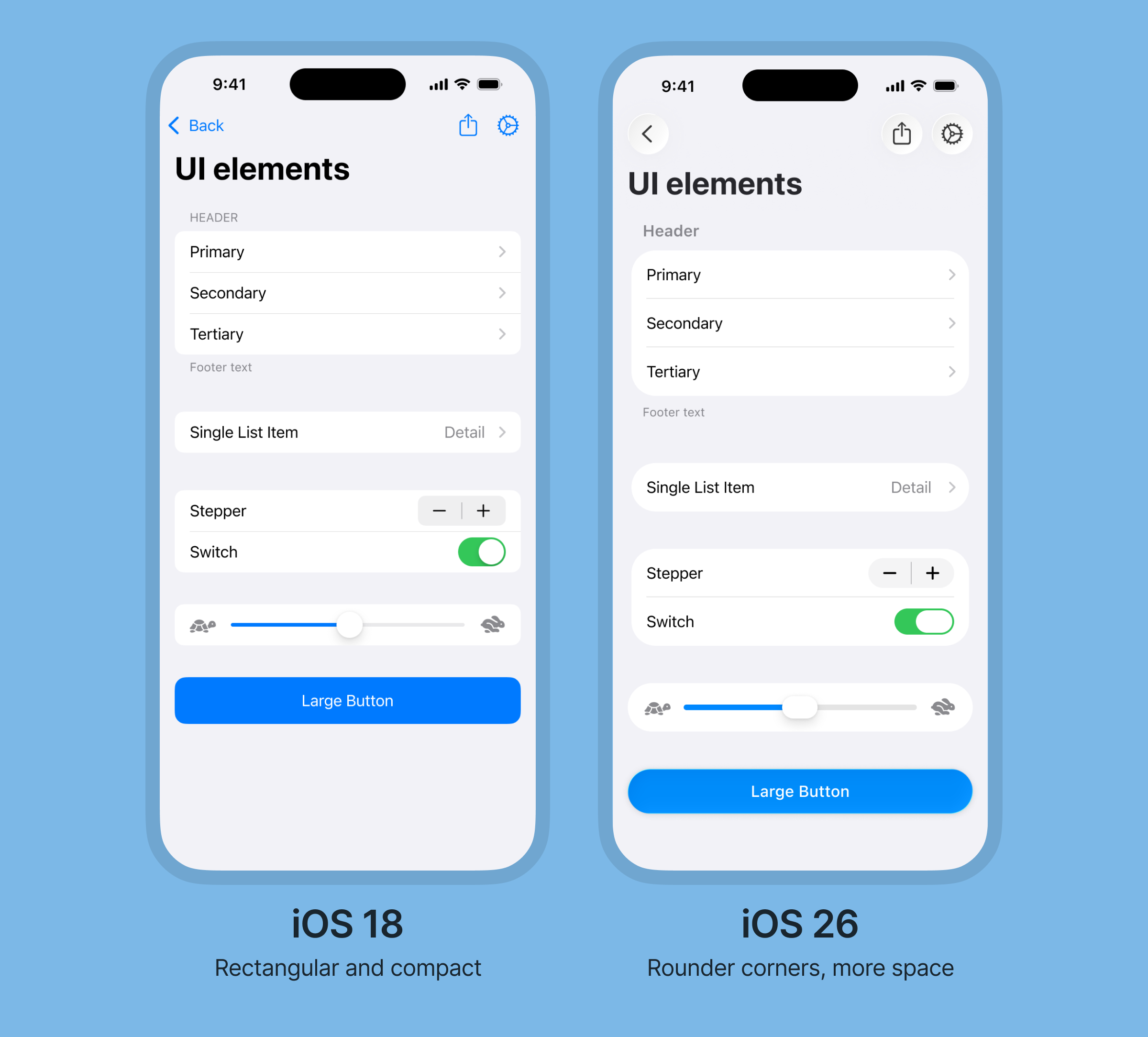
The increased roundedness gives the UI a friendlier, more modern look, similar to Android’s Material design.
Concentric shapes
Talking about rounded corners, iOS 26 is offering a new way to set corner radius using what’s called concentric shapes.
When using concentric shapes, the corner radius of the element adapts to its surroundings by subtracting the padding from the parent element.
This makes it easy to get the perfect corner radius for things like a button within a card, or to have a bottom sheet adapt to the corners of a device screen.
Navigation bars
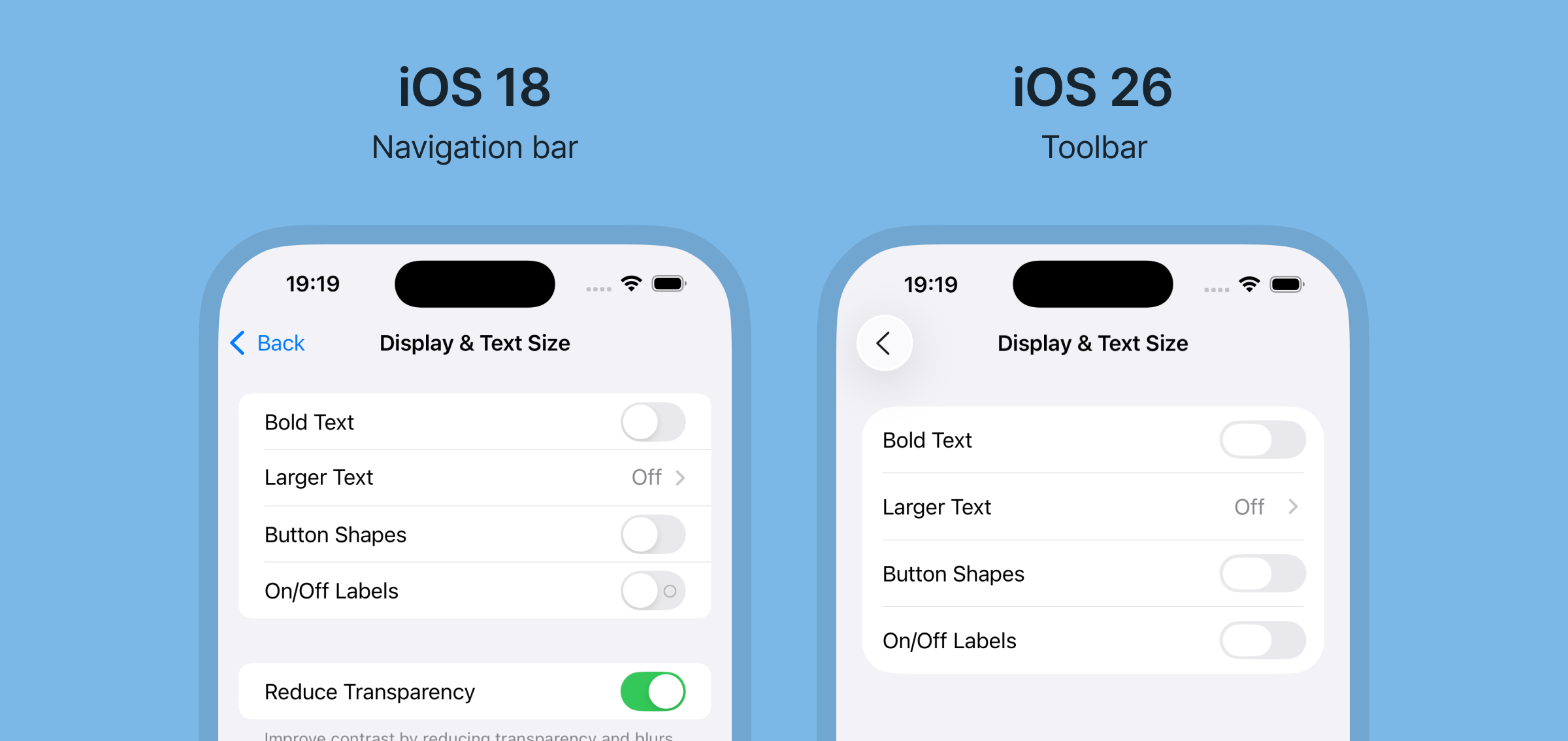
Starting from iOS 26, navigation bars are changing to toolbars, and the component have received both visual and functional changes.
Contained icon buttons
The most common labeled actions in the toolbar, such as the back button, are being replaced by icon-only buttons. Apple says this change is for standardized actions such as back, close/cancel and save/done.
Labeled actions are still available, but it seems icon buttons are preferred.
In addition to changing from label based buttons to icon-only buttons, these buttons are now contained. This means there is a defined space around the button, making it easier to recognize as a button.
Icon buttons can be used separately, or grouped together in a container.
Left-aligned title and subtitle support
There’s also some type specific changes in the new toolbar.
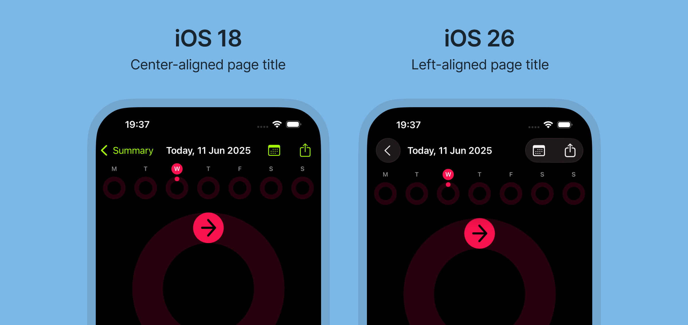
Firstly, there seems to be an option now to left-align titles in the toolbar, like Android usually does. It’s not clear wether this is done automatically when space is needed or if you can manually set this parameter, but it sure helps when you have multiple icon buttons such as in the Fitness app.
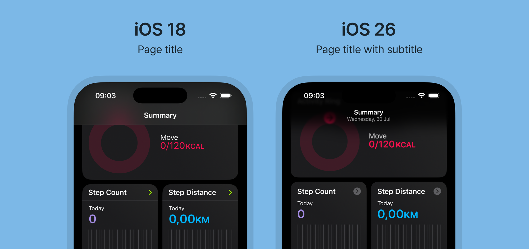
Secondly, a page subtitle is now available in the native component. Android has had this functionality in their App Bar for years, so it was about time iOS supported it too.
Other typography changes
In addition to support for subtitle and left-aligned title in the toolbar, there are a few more typographic changes in iOS 26.
Left-aligned text
It seems Apple is moving away from center-aligned text in and instead opting for left-aligned text in components such as alerts. It’s also visible in the onboarding sheets in Apple’s own apps.
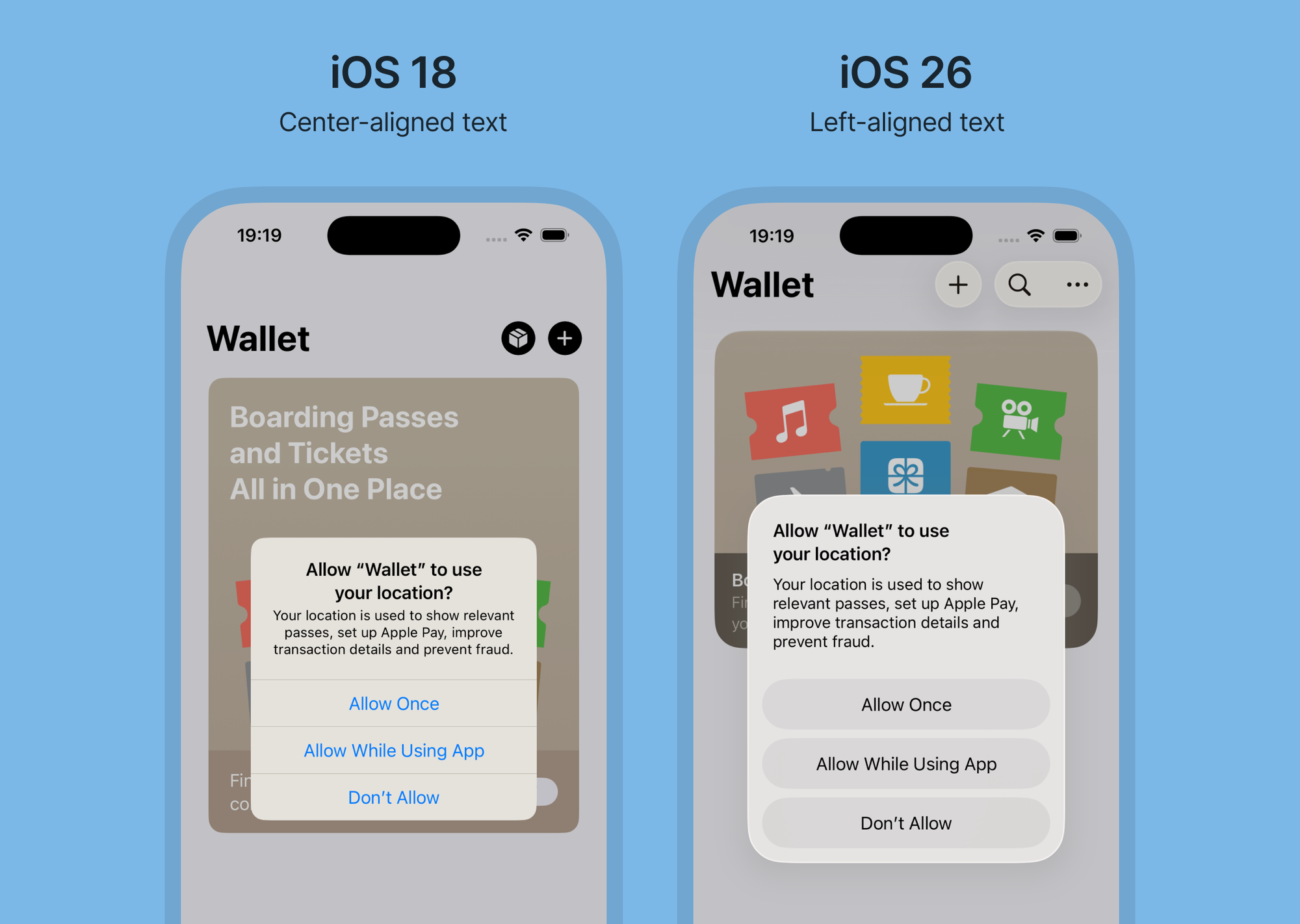
This is good news for readability, as left aligned text is easier to read, especially for longer paragraphs.
List titles
List titles have also been updated. These were previously all caps (uppercase), but are now formatted in regular sentence case. The text size has been increased as well.
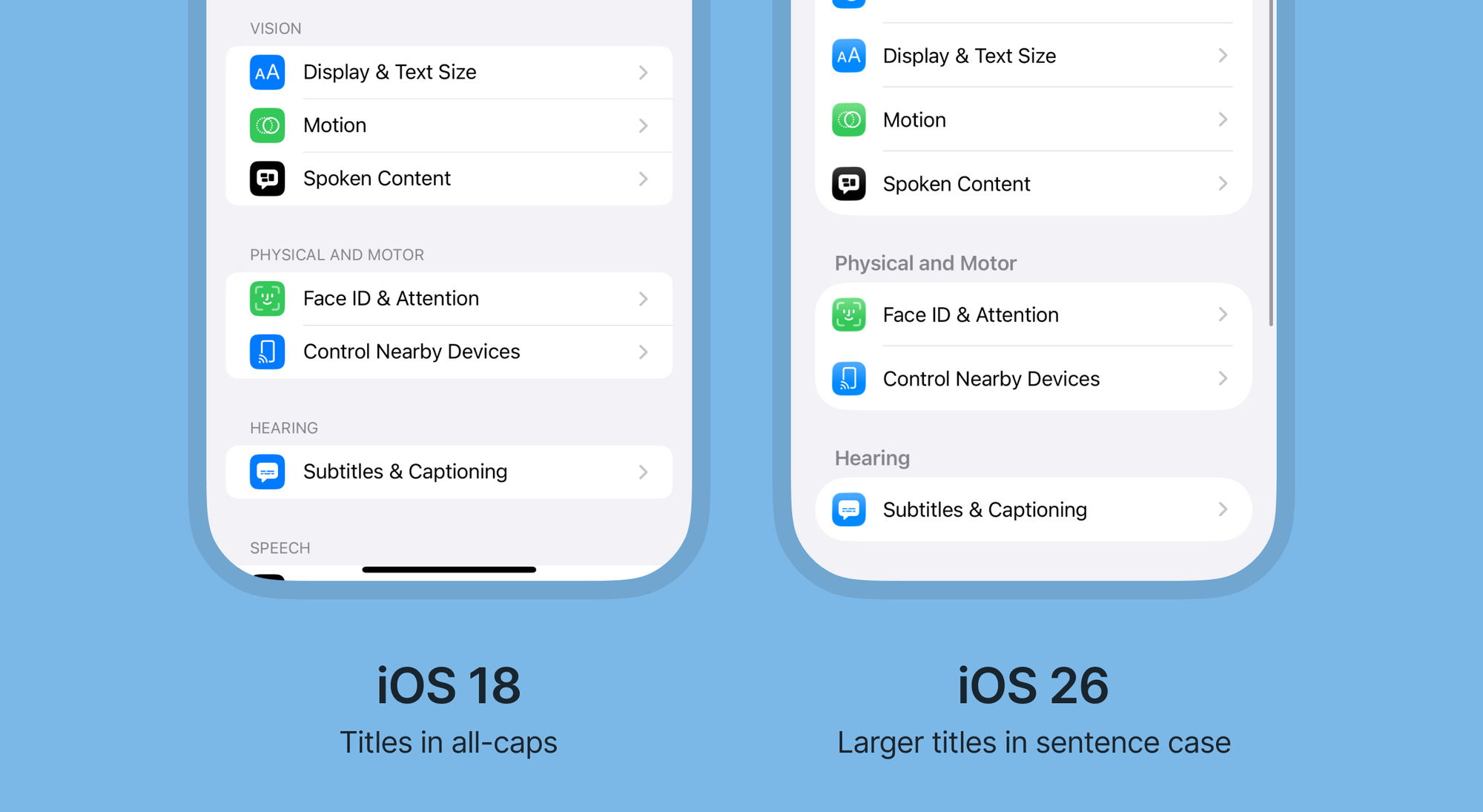
Again, great for readability.
Floating tab bars
Apart from using liquid glass, tab bars in iOS 26 are now are floating and more dynamic.
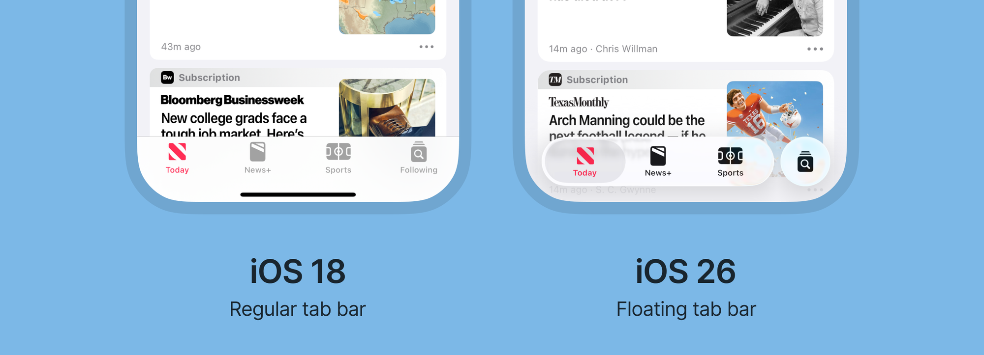
Search can be separated from the rest of the tab bar, and it seems Apple wants to standardize the pattern for global search in apps, by giving it a prominent space at the right side of the tab bar.
Search
Apps that have global search but don’t use a tab bar, such as the Settings app, now has search placed at the bottom of the screen. This makes it easier to reach, and also matches the position of search in the floating tab bar.
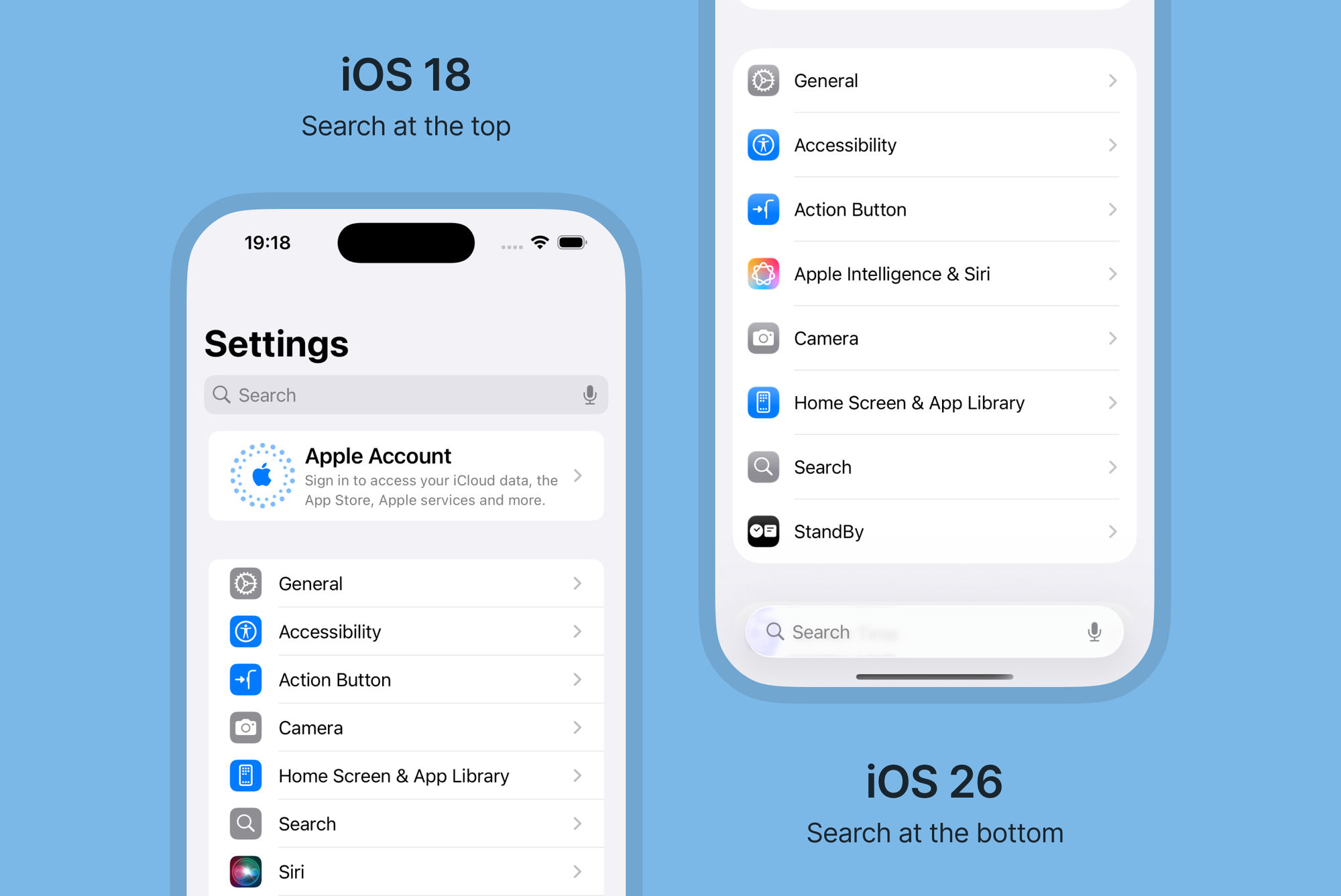
The repositioning seems to only be for global search (meaning searching across the entire app). As for non-global search, where you are searching only within a certain page, the search is still placed at the top of the page.
On larger screens like the iPad, global search is also still at the top, but now more integrated in the toolbar.
FABs are officially here, sort of
Floating action buttons (FABs) have been a part of Android’s Material Design for primary actions for many years, but has never been a part of native iOS components.
Apple introduced a FAB for the first time in their Journal app two years ago, but this year more apps are using a right-aligned FAB, such as in the Reminders app.
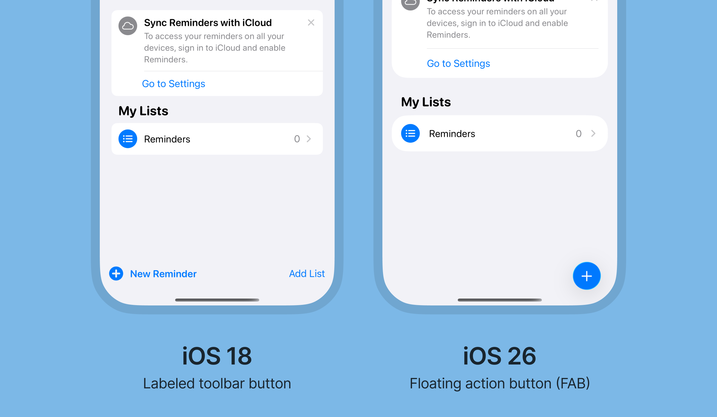
The FAB looks to be part of the updated bottom toolbar, which like the tab bar also is floating. It’s worth noting that these buttons are used in apps without a tab bar, so it appears Apple wants you to choose – either tab bar or bottom toolbar.
Material Design on Android on the other hand often use a FAB in combination with a navigation bar.
New scroll edge effect
To improve visibility of the new floating components at the top and bottom of the screen, iOS 26 introduces a new scroll edge effect.
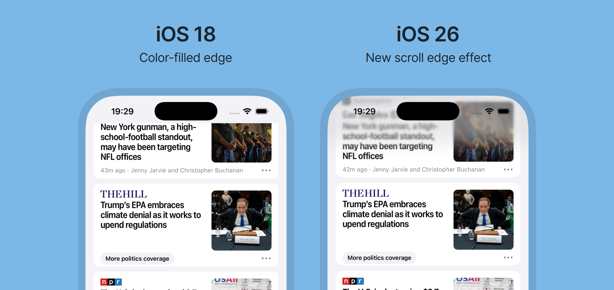
This effect is a gradual blur that fades from the top and bottom to make the background behind elements more toned down.
New behavior for fullscreen modals
Fullscreen modals has gotten a slight change in how they behave. In iOS 18 all fullscreen modals creates a visual stack at the top with a black background, but in iOS 26 the fullscreen modal simply covers the screen beneath.
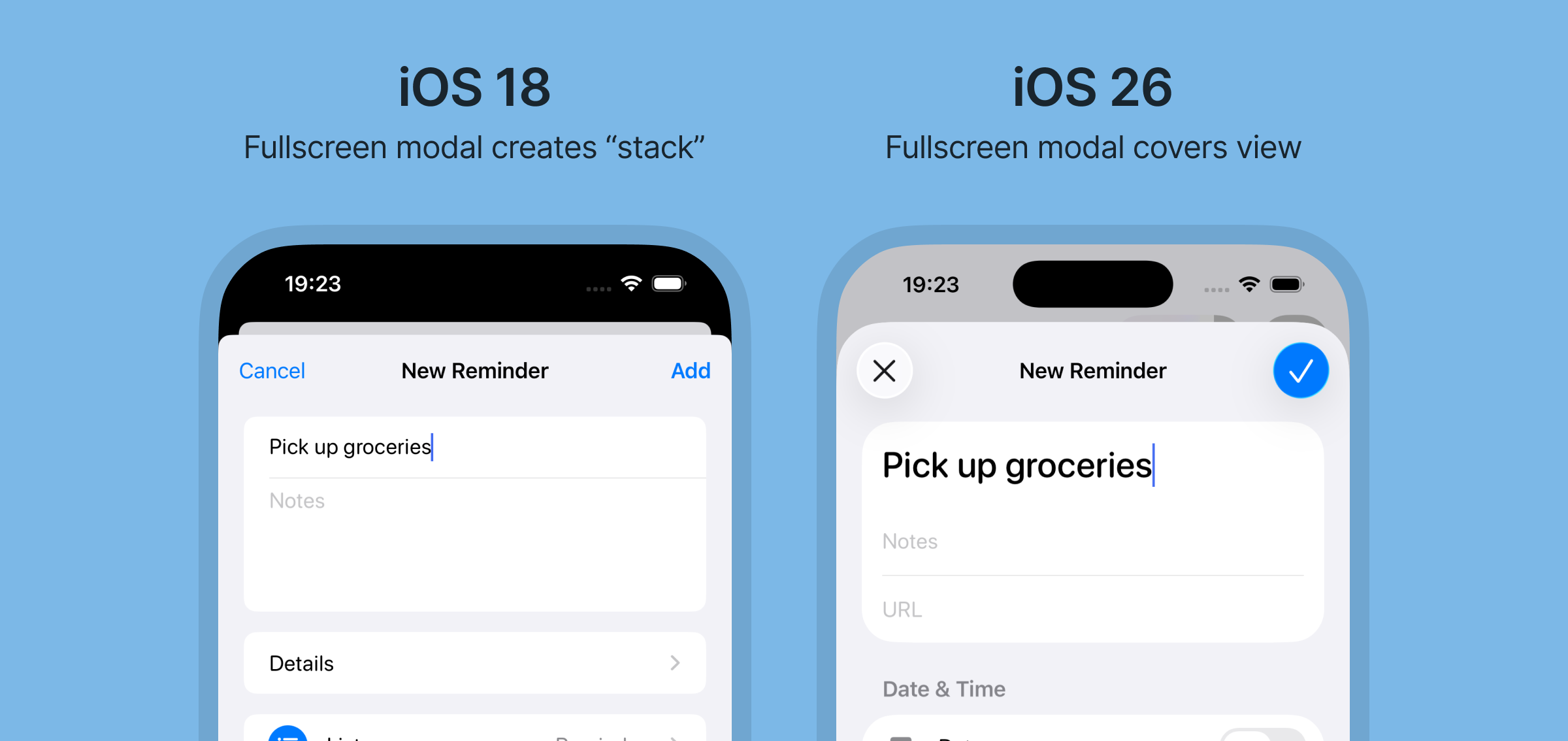
Only when an additional fullscreen modal is opened on top of the current modal does it create the visual stack.
Just like in the new toolbar, the top actions in the fullscreen modal are also being replaced by larger, icon-based buttons instead of text buttons.
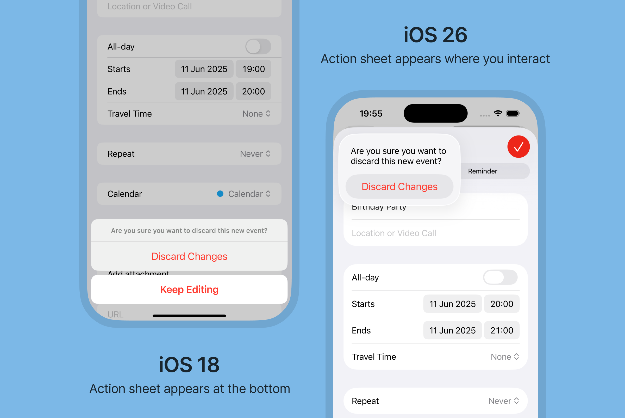
Action sheets appear where you interact
When performing actions such as closing a fullscreen modal, the action sheet now appears where you’re tapping (on the close icon) instead of at the bottom of the screen.
In summary
- Everything’s rounder and more spacious
- Navigation bars are now called toolbars and come with changes such as support for subtitles
- Labeled actions are changing to icon buttons
- Icon buttons are contained, making them look more like actual buttons
- Typography is moving to left-aligned and sentence case, improving readability
- Tab bars are floating
- Search is moved to the bottom of the screen
- Action sheets appear where you interact
What do you need to do?
If you’re responsible for the design of an iOS app that’s using native components, you will automatically be getting the updated components when building for iOS 26. However it’s a good idea to have your developer to compile a test build to check if anything breaks before hitting the publish button.
If you’re not currently using native components, you might consider if now is a good time to start using native components, or if you want to make updates to your custom components.
You might also want to consider making changes to your app’s overall design to be more in line with the round and spacious look of iOS 26.
Will you be making changes to your app for iOS 26?
Let me know!

