The Basics of Elevation on Android
In this post, we will look at the different types of elevation in Material Design, and how they can be used when designing Android apps.


What is elevation?
According to the Material 3 guidelines, elevation is the distance between two surfaces on the z-axis. In other words, elevation is how high elements are “lifted” on the screen.
Elevation is used for creating depth in the UI, as well as to provide emphasis to components.
Different types of elevation
As of Material 3, there are two ways of applying elevation to components: shadow elevation and tonal elevation.
Tonal elevation
Tonal elevation uses color to define elevation levels. Tonal elevation gets darker the higher up the elevation.
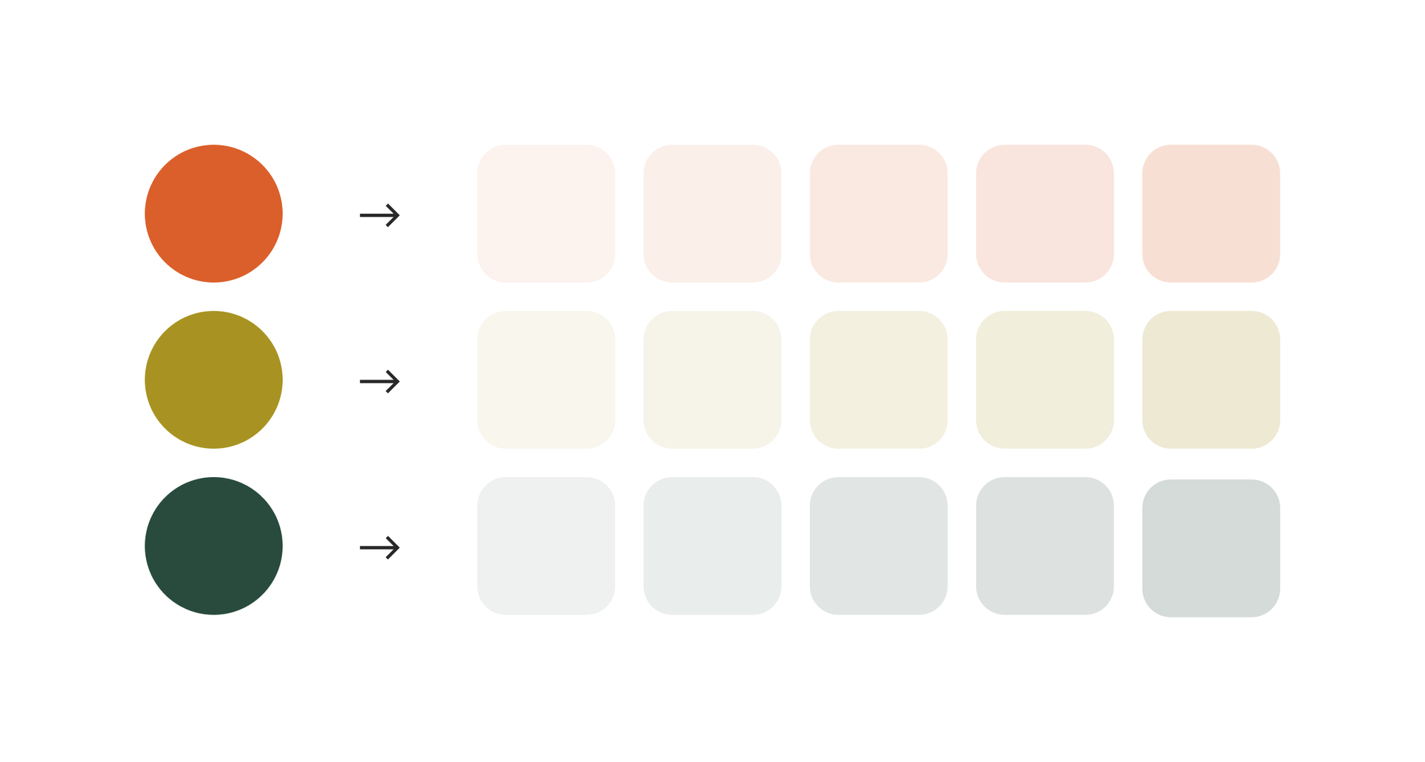
The color used for tonal elevation is based on the primary color. This means if you have a green primary color in your material theme, the tonal elevation will be tinted green. If you have an orange primary color, it will have an orange tint.
Shadow elevation
Shadow elevation is simply using shadows to set levels of elevation.
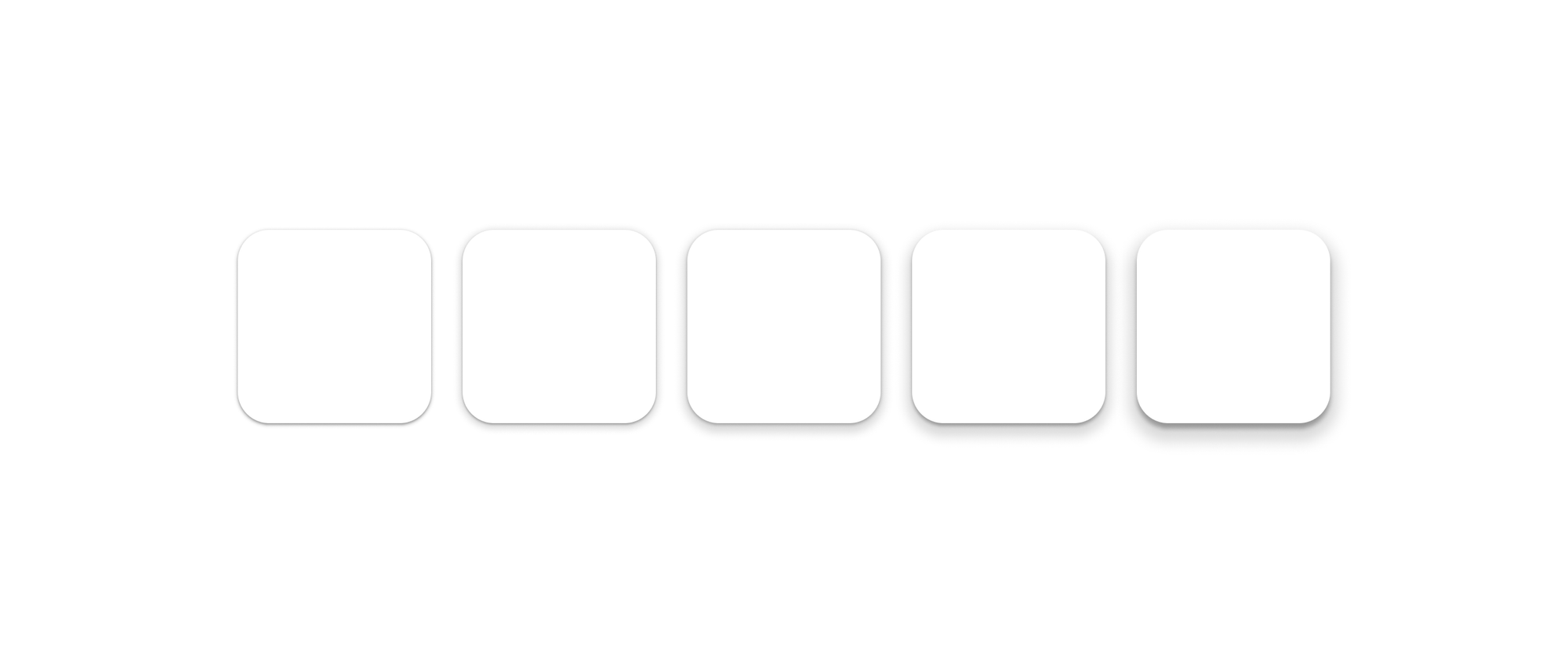
The higher the elevation, the more prominent the shadow is.
When using only shadow elevation, the color of the container remains the same.
Combining tonal and shadow elevation
Tonal elevation and shadow elevation can also be used together.
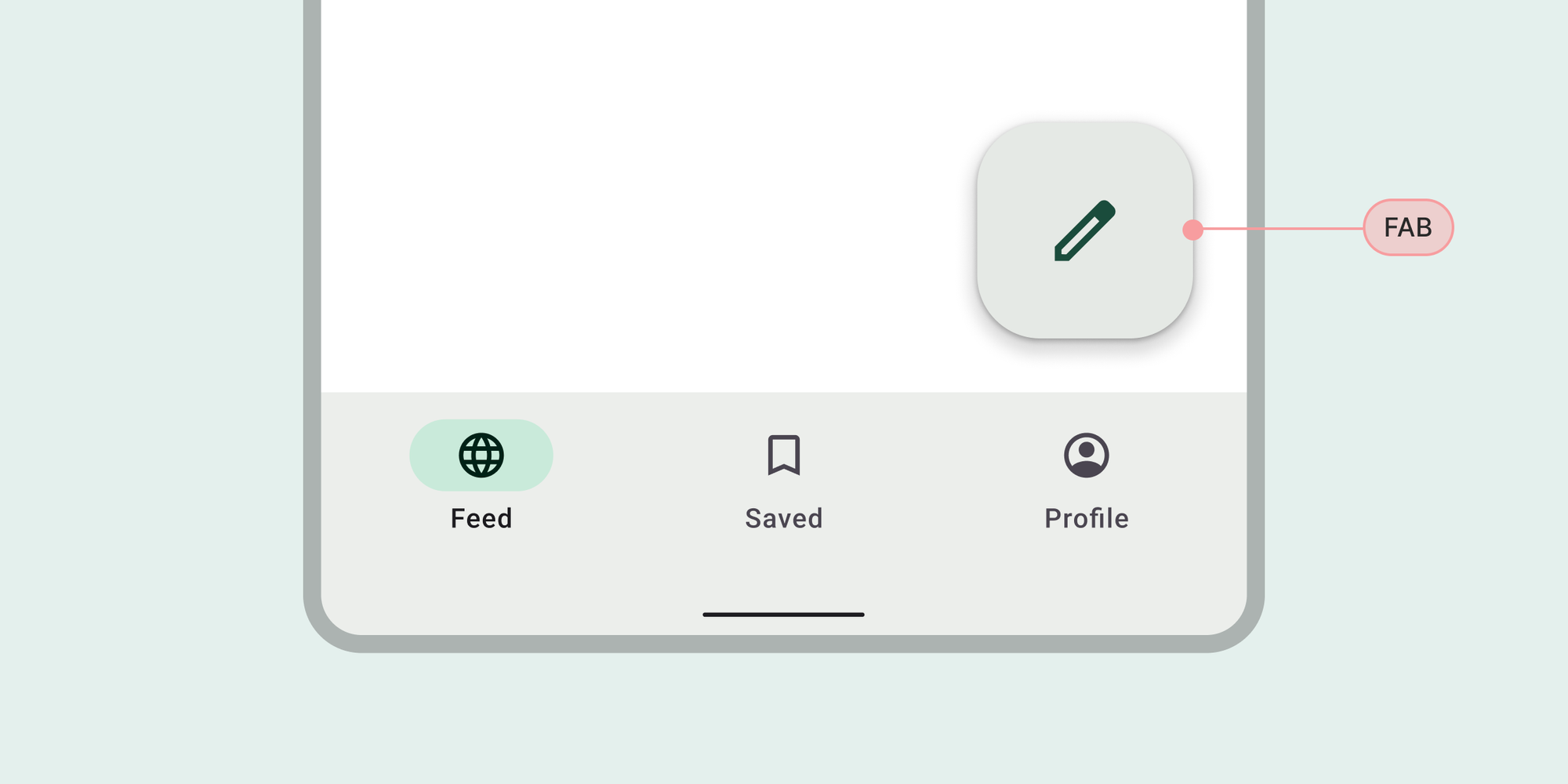
In fact, most of Material’s components that use shadow elevation (e.g. FABs or Menus) also use tonal elevation.
Using scrims for extra focus
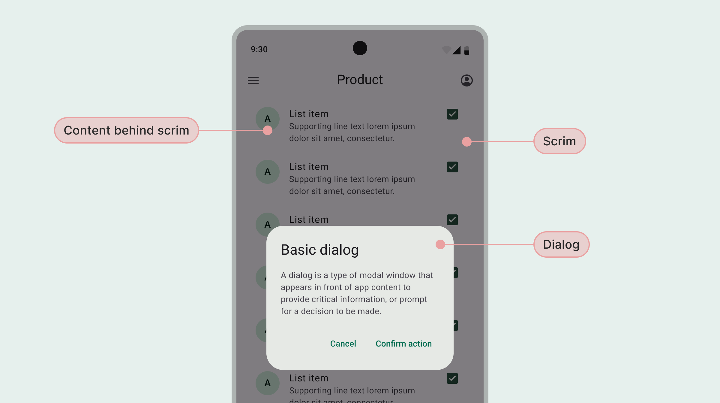
In addition to tonal and shadow elevation, you can use a scrim to provide more focus to elements like Dialogs or Bottom Sheets.
Scrims are backdrops that use a dark, semitransparent background, covering the entire screen behind the element in focus.
Which elevation style should you use?
According to Material 3 guidelines, you should prefer tonal elevation. You should only use shadow and/or scrims for elements that need more focus, or to avoid overlapping elements from blending into each other.
If you’re using native components in Jetpack Compose, you don‘t have to worry about setting elevation, as these components already have elevation predefined. However, you can always override these values if you want.
Defining elevation using levels
Elevation on Android is defined using levels, which correspond to a dp value. There are six levels of elevation in Material 3:
- Level 0: 0dp
- Level 1: 1dp
- Level 2: 3dp
- Level 3: 6dp
- Level 4: 8dp
- Level 5: 12dp
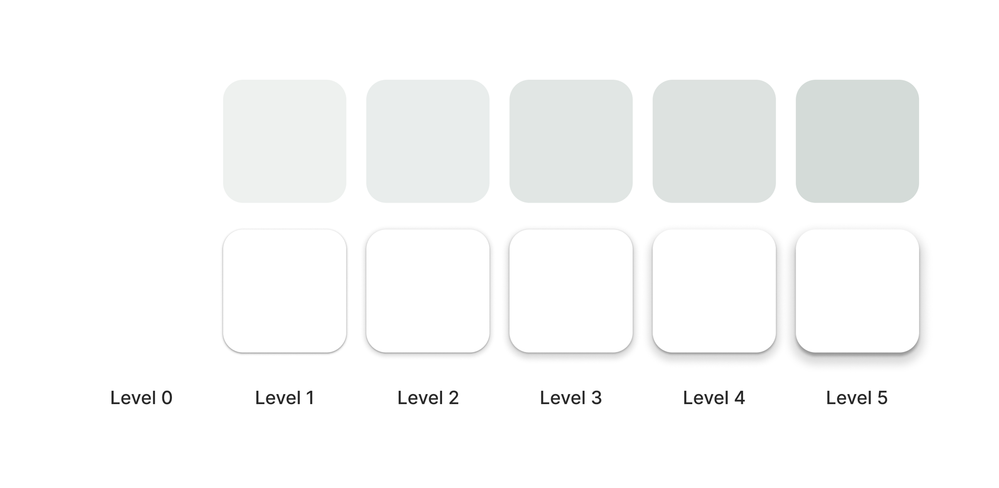
Level 0 elevation is used on components that lay “flat”, like regular filled buttons and outlined cards.
Level 1 elevation is used on components like elevated cards and bottom sheets.
Level 2 elevation is used on components like the navigation bar and menus.
Level 3 elevation is used on components typically overlaying all other elements on the screen, such as a FAB or a dialog.
Level 4 and 5 are mostly used for hover states and may not be as relevant in mobile app design.
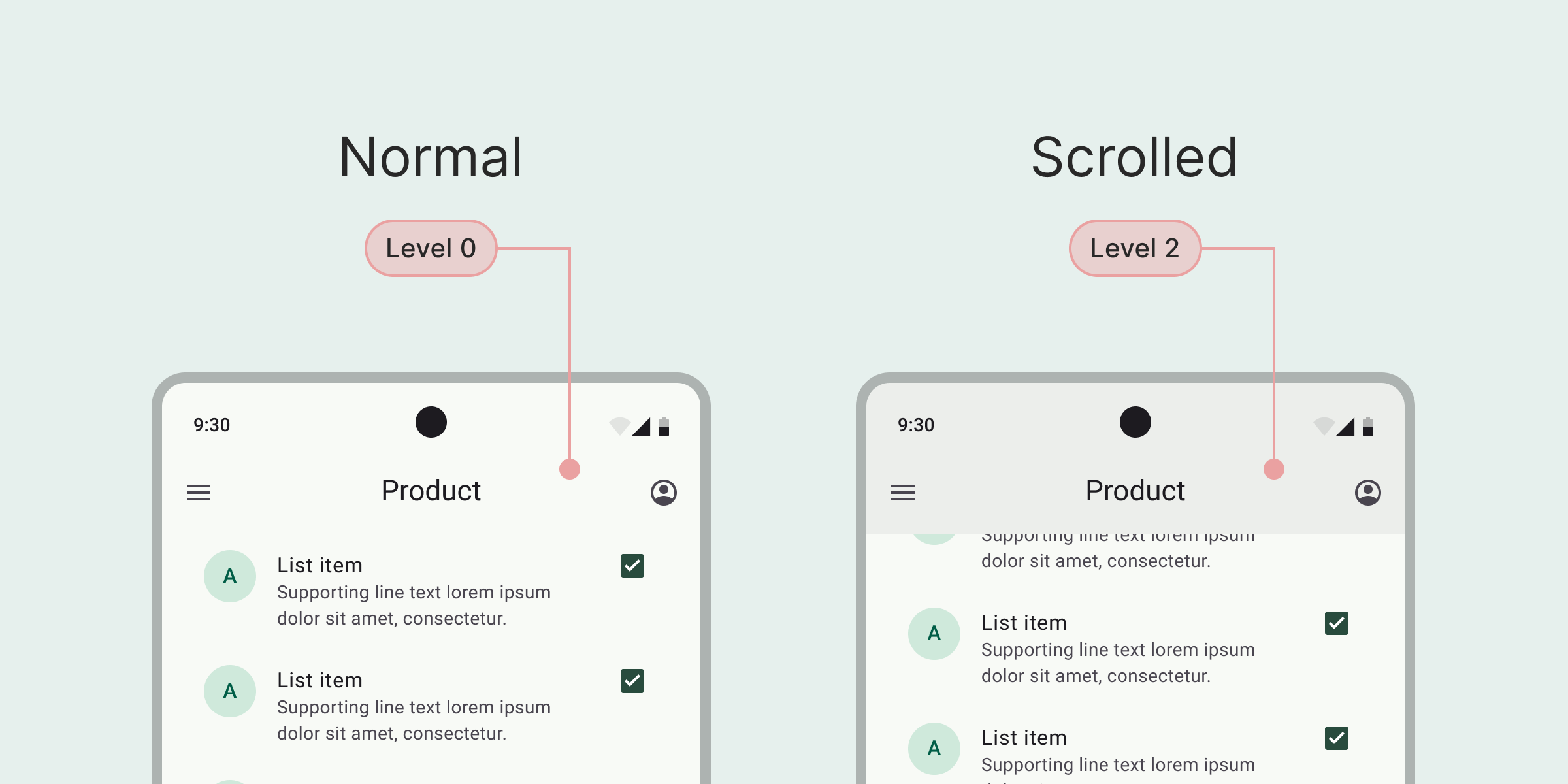
Some components change elevation based on interactions, such as a Top App Bar shifting from level 0 to level level 2 when scrolled.
How to apply elevation styles to elements
Setting elevation on Android components using Jetpack Compose is easy.
The different levels come with predefined styles, which means you can simply set an element to use for example Level 3, and the elevation style will be applied.
I hope this post gave you some insight into how you can start using elevation in your designs.
As always, let me know if you have any questions.
Happy designing!