6 Cool New Things From Material Design and Android 14
Google’s annual developer conference Google IO was held last month, and with that came lots of new features and updates for Android and Material Design. Here’s some of the most interesting new things for app designers.

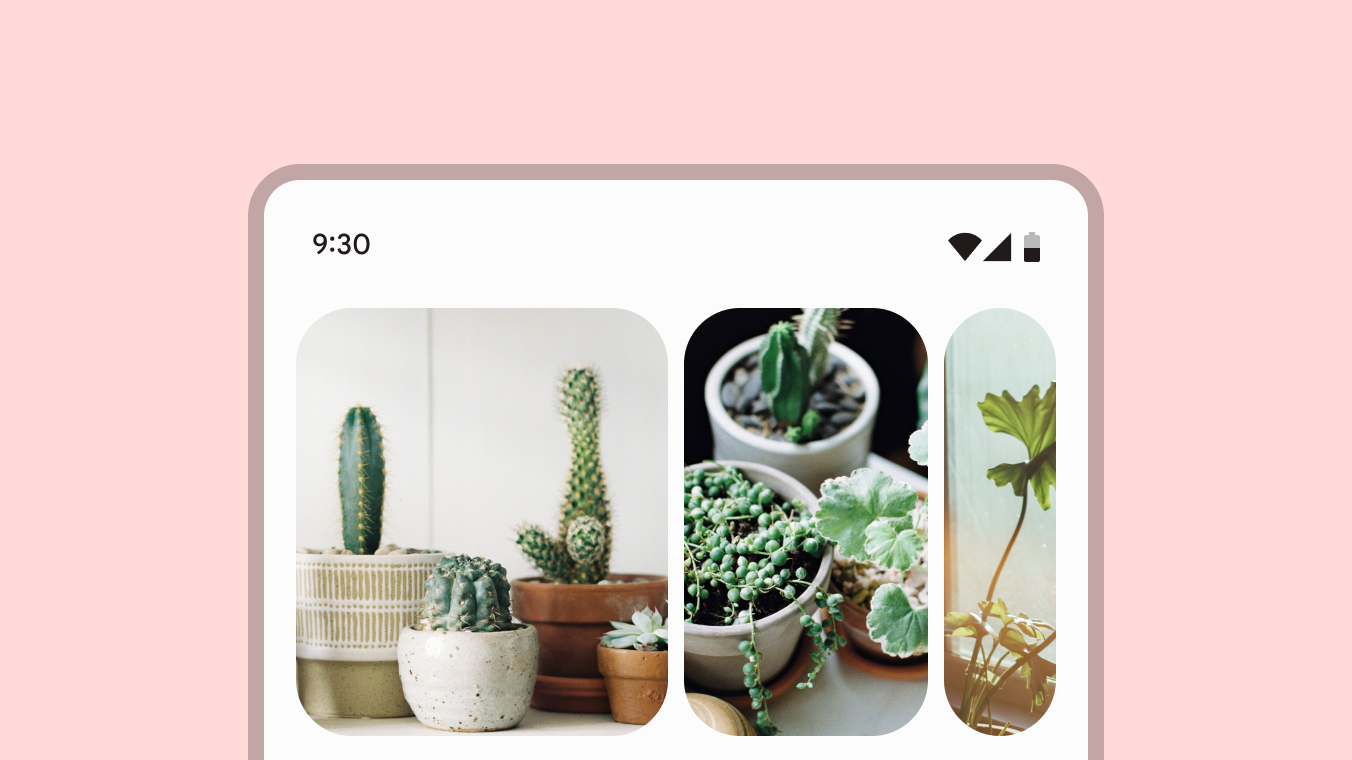
1. New gallery component
A brand new gallery components has been added to Material Design, enabling you to really elevate your app’s gallery game.
This new component features a smooth parallax effect while expanding and collapsing the images as you scroll.
If you’re interested to see what it looks like in motion, and learn more about how the new gallery component came to be, check out the post at the Material Design Blog.
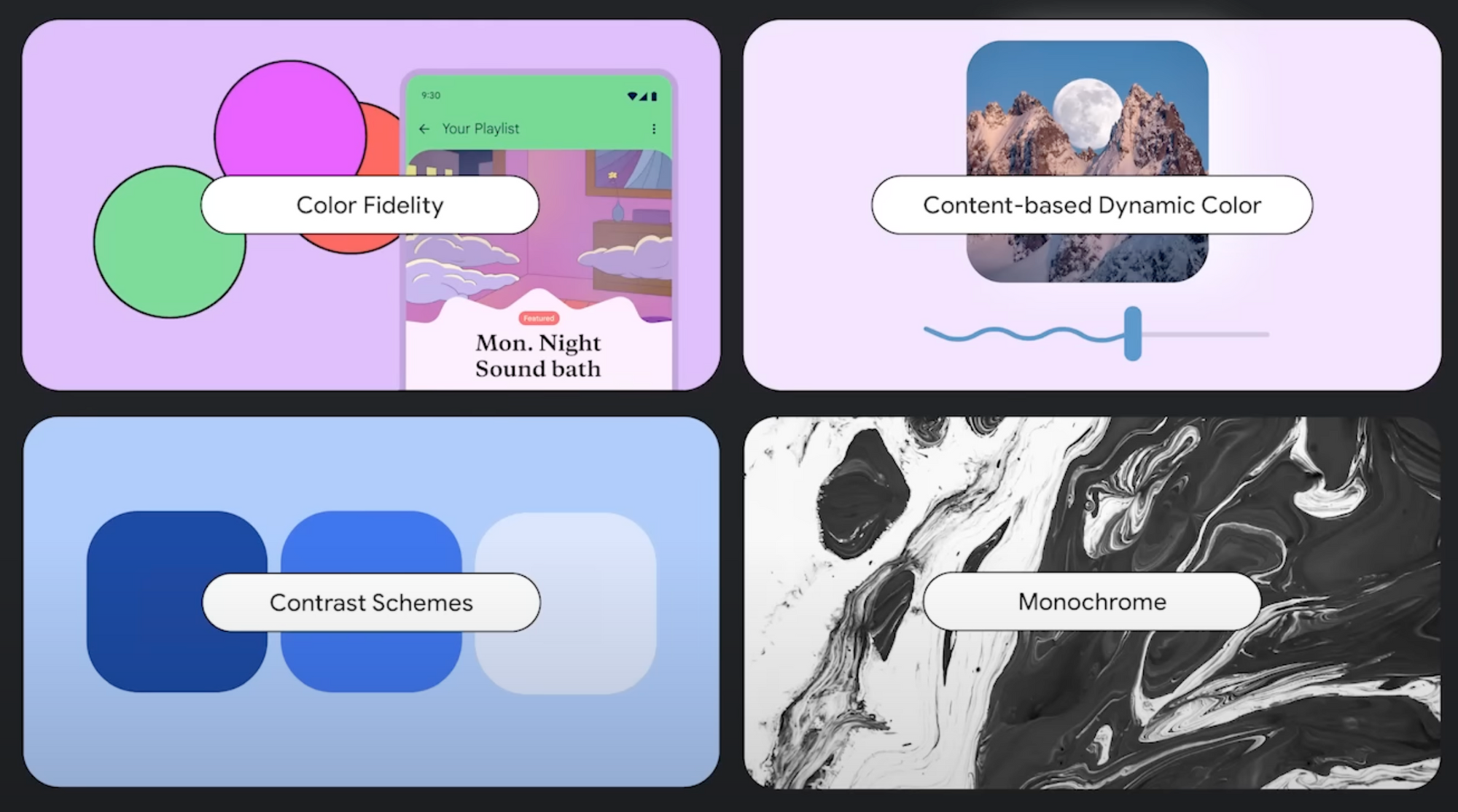
2. Updates to adaptive color
Adaptive color is a way for users to personalize the look of their apps by creating a color palette based on their background image.
In the latest release of Material 3, adaptive color is getting four new updates: color fidelity, content-based dynamic color, contrast themes and monochrome.
Color fidelity
Color fidelity lets you turn up the dial to create themes with bolder, more vibrant colors, instead of being limited to the current light and more pastel-like colors you might be used to.
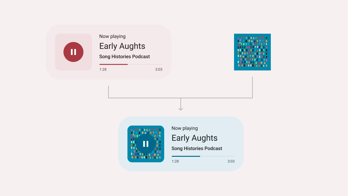
Content-based dynamic color
Content-based dynamic color lets you dynamically change the background color based on the colors of an image. This makes for a great effect when scrolling through cards of books or movie titles—or with a music player like the image shown above.
Contrast themes
Contrast themes lets users with vision impairment increase the contrast of an app’s color palette to improve legibility, while still maintaining the color theme.
Monochrome schemes
Monochrome schemes lets you create «colorless» themes in black and white. This is not just a grayscale filter though—all the colors have been carefully selected to ensure a sleek and well-balanced look.
In a monochrome theme, hues will still be preserved in important contexts, so things like photos will still be displayed in full color.
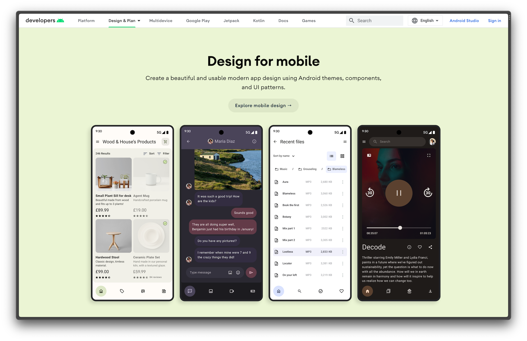
3. Guides for designing Android UI
With the new design guides on Android, Google is making it easier than ever to learn about designing specifically for Android.
These guides include everything from foundational concepts such as layout and navigation, to utilizing color, theming and Material components.
Check out all the new guides at the Android Developers website.
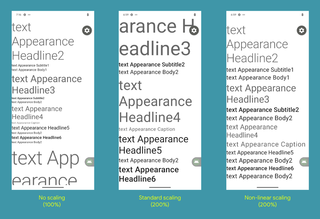
4. Non-linear font scaling
One of the great new accessibility features coming to Android 14 is non-linear font scaling.
With non-linear font scaling, text elements will scale differently based on their original font size. This means that for example titles that are already large won’t scale up as much as small text when increasing the system font size.
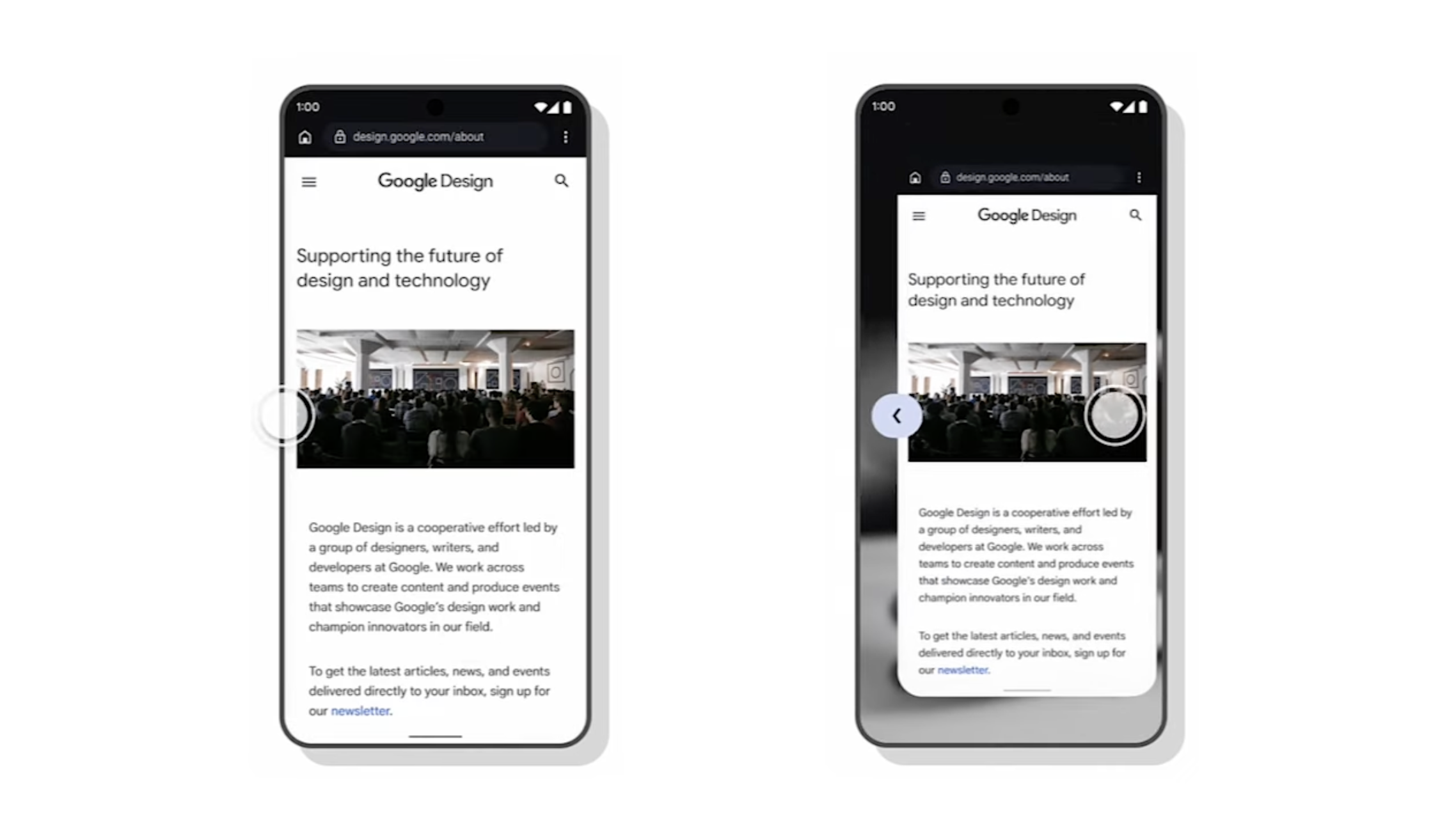
5. Predictive back animations
Navigating backwards on Android can sometimes be confusing, as you might not know where the gesture will take you.
Google is hoping to solve this problem with a new predictive back animation.
With this new animation, the previous page is shown in the background as you swipe, giving you a better idea of where that back navigation will take you.
Read more about this and other gestures at Material Design Guidelines.
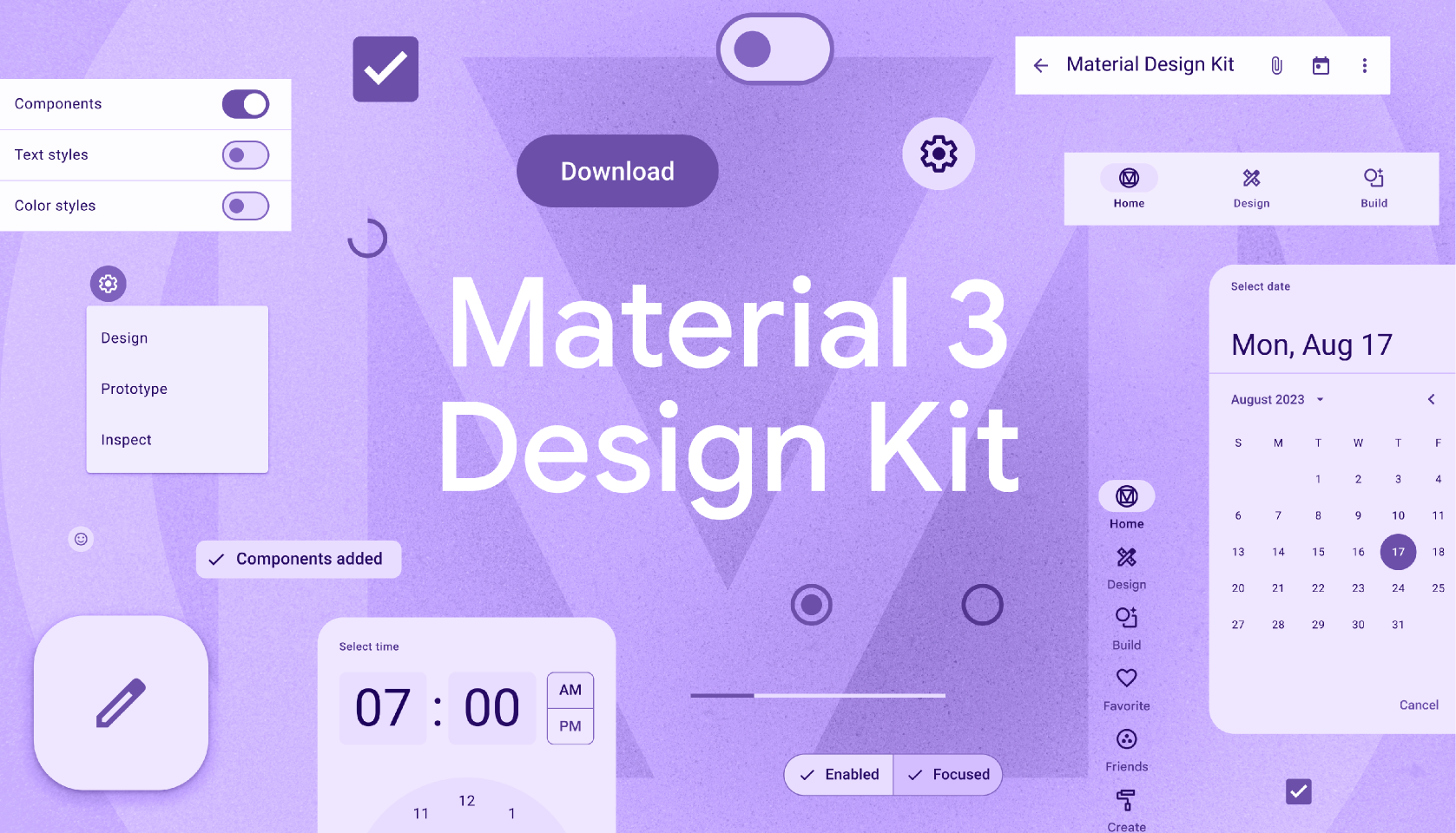
6. Updates to the Material 3 Figma template
The Material 3 Design Kit is a great resource for designing native Android screens in Figma.
The latest update include the new gallery component mentioned earlier, along with side sheets and tooltip components, prototyping capabilities with variant animations, and more.
A lot of the components have also been refactored to make them easier to use.
Read about all the new updates on the Material Design Blog, and download the file from Figma Community.
Conclusion
With these new Material components and UI guides, along with improvements to dynamic color, accessibility and animations, it’s easier than ever to create great native Android experiences.
Which of these new improvements and features are you most looking forward to?
Are there any other features that you’re looking forward to in Android 14 and Material Design? Let me know!