Things to Consider When Selecting Fonts for Your app
Fonts are an integral part of any UI, but not all fonts are created equal. In this post, I’ll provide some tips for what to look for when selecting fonts for your app.

The easy way: system fonts
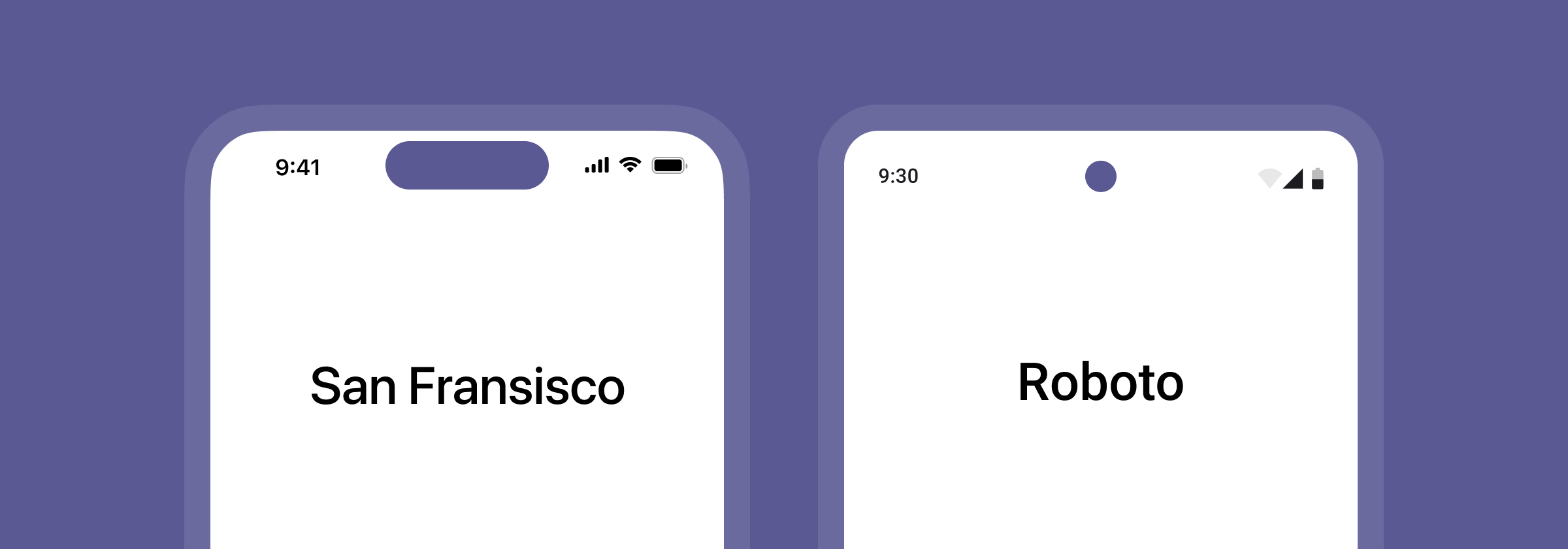
If you don’t want to spend a lot of time searching for fonts, one option is to go with the system fonts on each platform, San Francisco on iOS and Roboto on Android.
They are both developed specifically for screen and therefore works great in apps.
Using system fonts you also won’t have to spend a lot of money on font licenses, which can be expensive.
However, the main disadvantage with going with system fonts is the need for keeping two sets of font styles in your design system—one for iOS and one for Android.
Using the same font on both platforms
If you don’t want use the system fonts on each platform, you can select one font to use for both.
A single pair of font styles are easier to maintain, and also makes it easier when porting screens from for example iOS to Android.
In terms of branding, sticking with just one font will also make sure you have consistent visual identity across platforms.
Now–let’s look at what you need to keep in mind when looking for fonts for your app.
The bounding box test
There are lots of great looking fonts out there.
Unfortunately not all of them function well in practice, especially in apps.
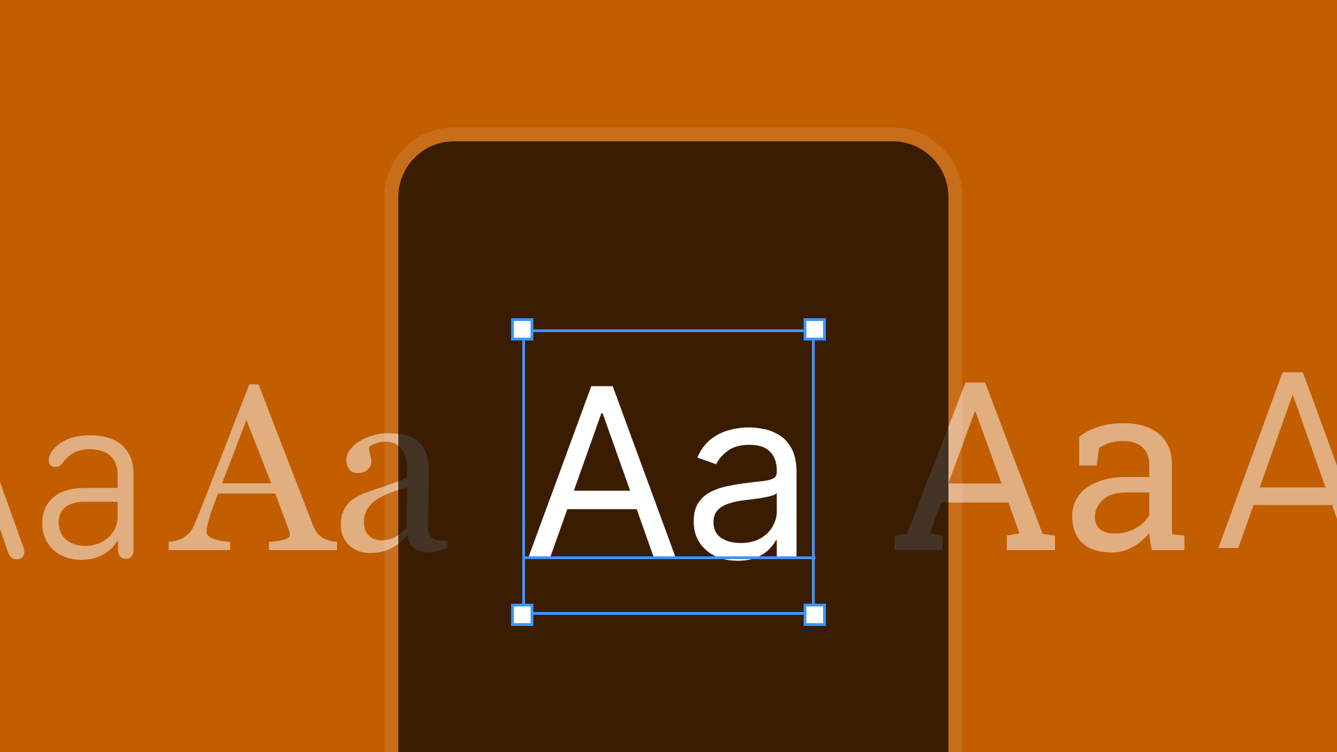
One way to find out whether a font will work well in a UI context is to use what I call the bounding box test.
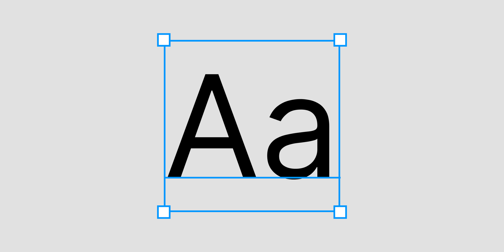
A bounding box is the amount of space a block of text takes up, including the space above and below the text itself.
The point of doing the bounding box test is to see if a font is vertically centered inside its bounding box.
If the text is centered, that means the spacing above and below the text is more or less the same.
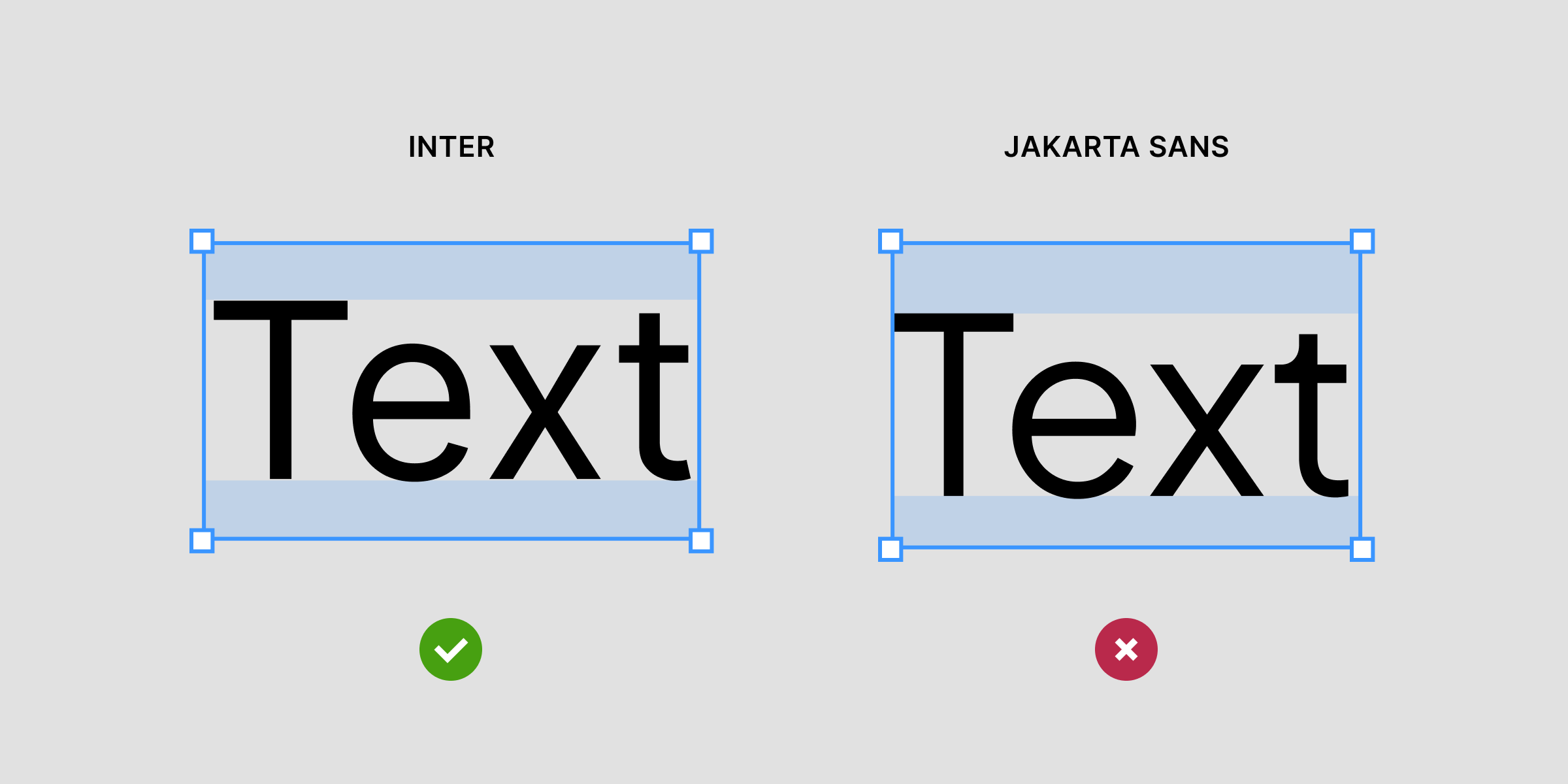
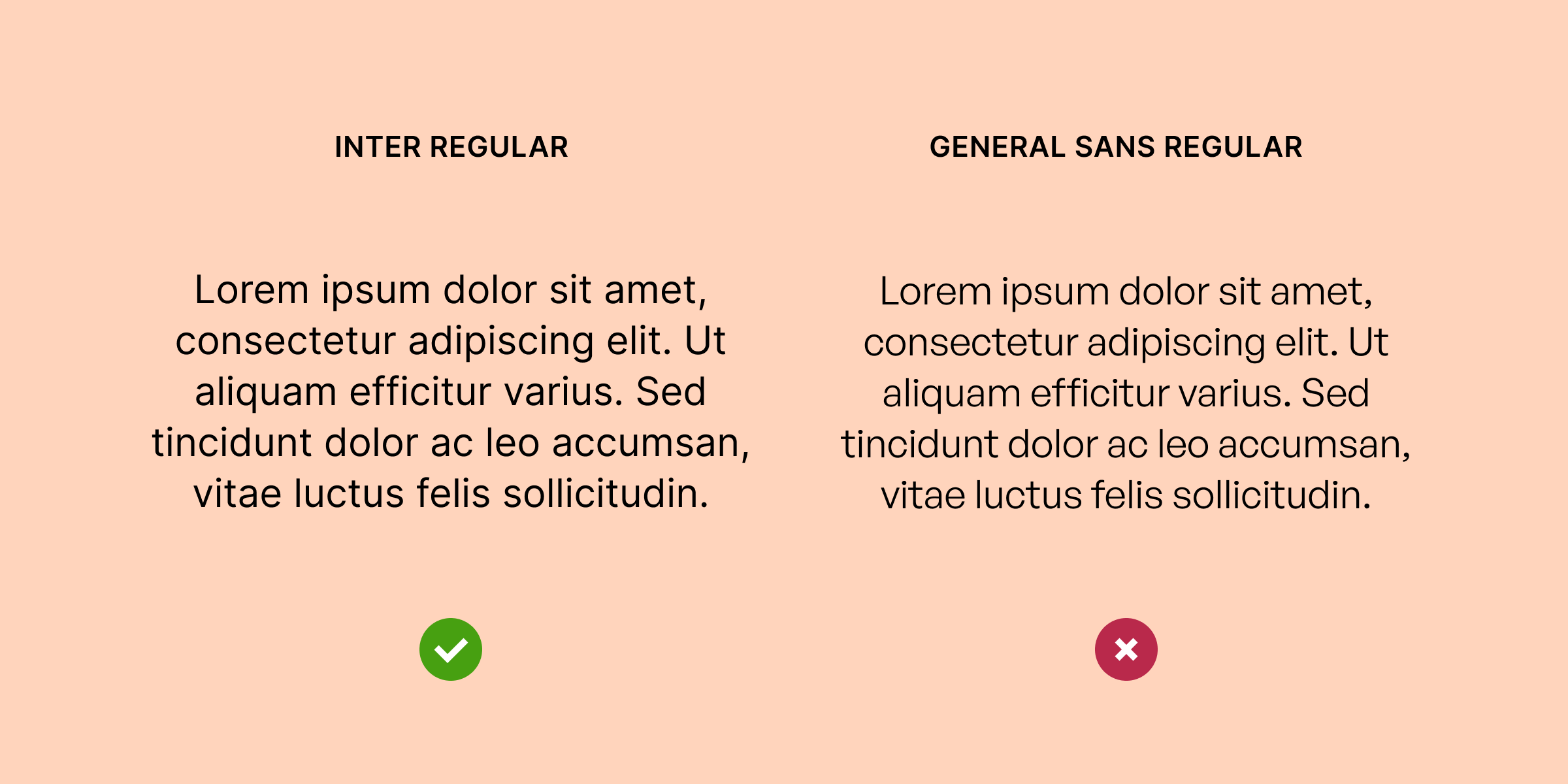
Here’s an example of a font that passes the bounding box text, versus one that doesn’t. If you look closely, you can see that the spacing inside the Inter bounding box is even, while on Jakarta Plus, the there’s more spacing on the top than the bottom.
If the text is not centered in the bounding box, it will not be centered in a button or any other UI element. Then you might need to compensate using more padding at the bottom than the top, making it harder to keep your designs consistent.
So, select a font that passes the bounding box text—it will save you a lot of hassle.
Selecting weights
Fonts often come in different weights, meaning different thickness–or “boldness”– if you will.
Some fonts have only one weight, while others have 6-8 different weights—from hairline (thinnest) to black (thickest).
My suggestion is choosing a font that has at least 3-4 weights; Regular, Medium, Semibold and Bold.
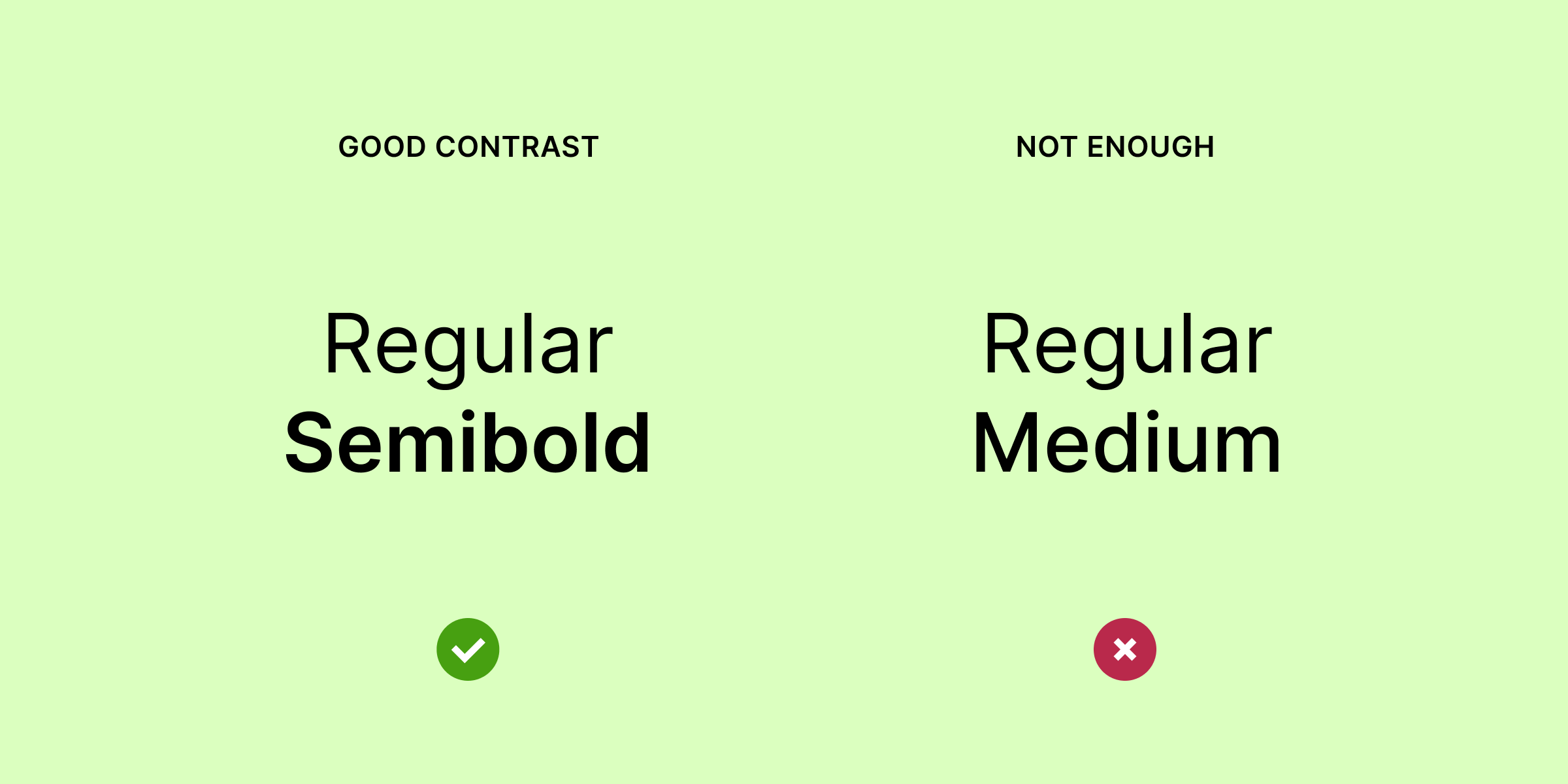
When selecting weights, make sure there is enough contrast between the variants.
There is usually too little contrast between a Regular and Medium, or Semibold and Bold, so instead going with a Regular and Semibold or a Regular and Bold weight is often a good starting point.
It is also a good idea to check whether the Regular weight of a font actually resembles what a regular weight should be.
If it’s too thin, it might be harder to read for things like body copy, and generally look unbalanced in your UI.
Do you need italics?
Another consideration worth taking into account is whether you need italics in your app.
It’s getting more and more common to use a bold weight to highlight text or single words in a text rather than italics.
For that reason, your app may not need italics. However, if you’re designing a content heavy app, such as a reader app, you definitely want to choose a font that has italics.
If you’re not sure if you need italics, I suggest going with a font that has them (at least for the body font). That way you have italics available if the need should appear later on.
Summary
Now you know what to look for when selecting fonts for your app! Here’s a quick summary of everything we’ve covered:
- Using system fonts is fine, but selecting a single font for both platforms will make it easier to manage your font styles
- Do the bounding box test to make sure your font is vertically centered in the bounding box
- Select a font that has at least 3-4 weights, and make sure the font weights you combine have enough contrast
- Make sure the Regular weight is actually a Regular
- You might not need italics, but selecting a font that has italics will make it easier for you down the line (if you’re designing a reader app, you definitely want a font that has italics)