Tab Bars vs Navigation Bars
Tab bars on iOS and Android have a lot in common, but also some differences when it comes to styling. Read more for all the details in this component comparison.

Definition
Tab bars represent the top-level navigation of your app. They provide users with an overview of what they can do in the app and help them quickly switch between the main views.
Human Interface Guidelines vs Material Guidelines
Naming
Although this component is similar on both platforms, it has different names on iOS and Android.
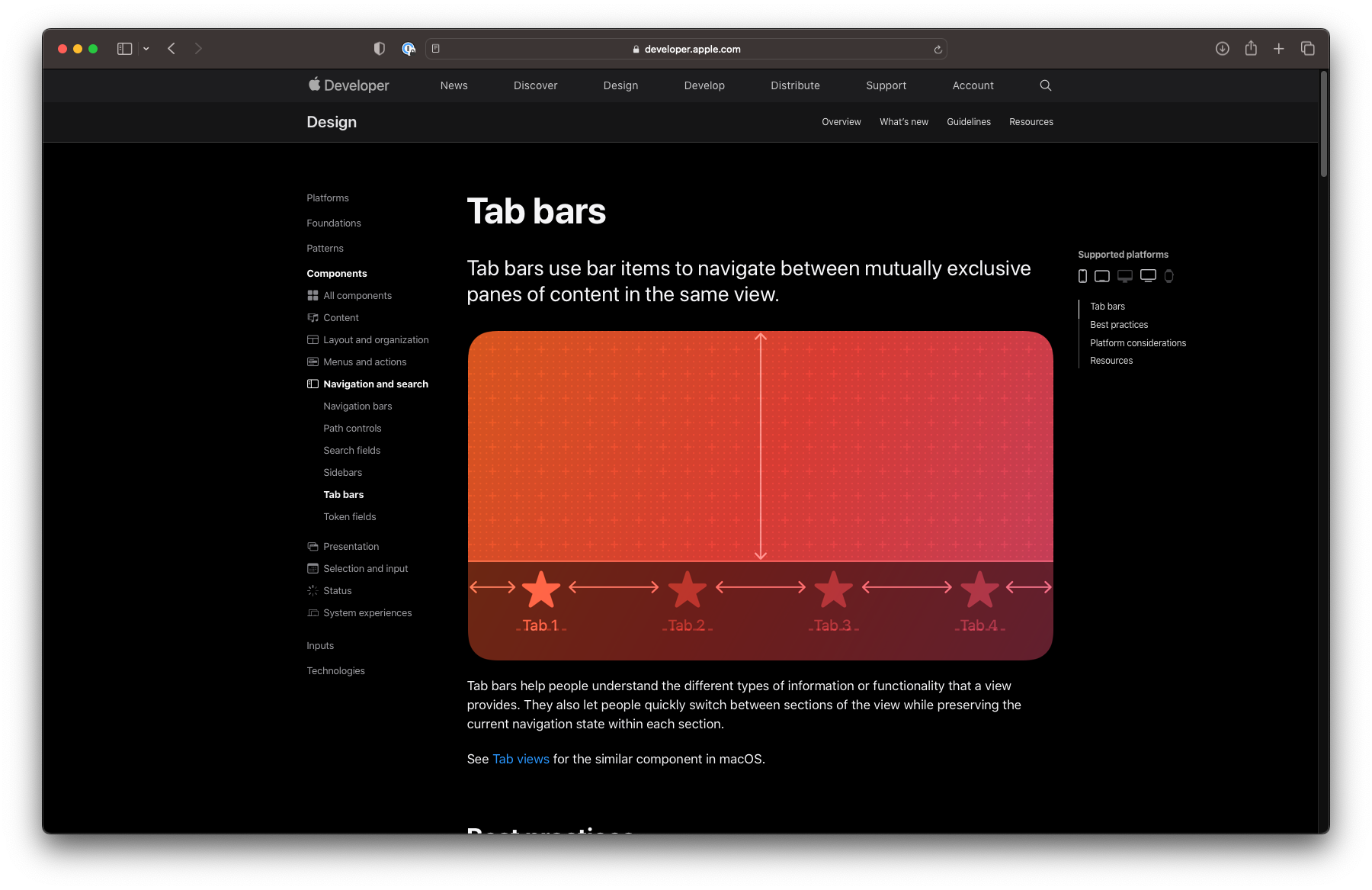
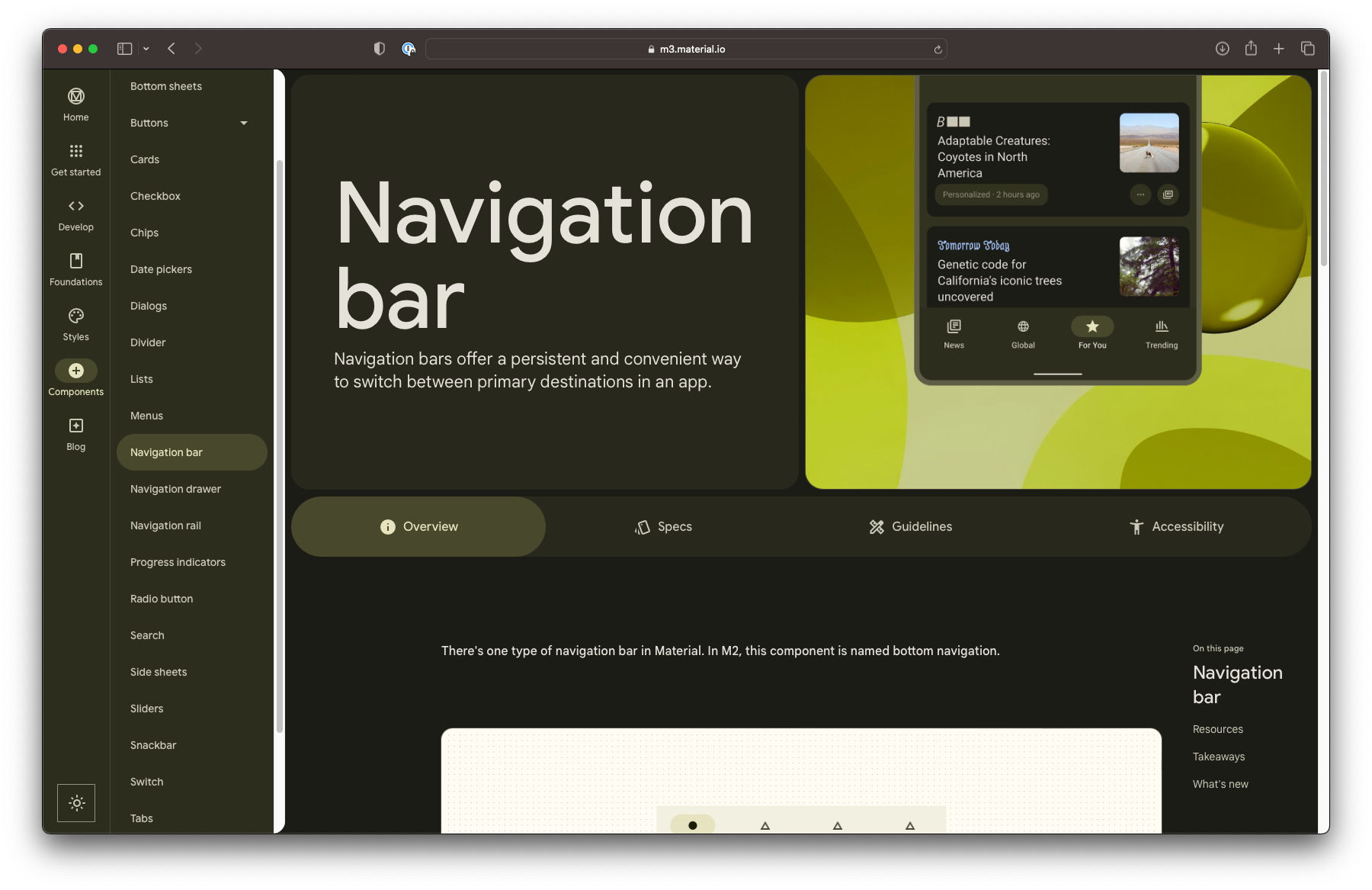
On iOS, it’s referred to as a tab bar, while on Android it’s called a navigation bar.
Navigation and interaction
When it comes to interaction, both tab bars and navigation bars work as you would expect. Simply tap on each tab to instantly switch between views.
Both Human Interface Guidelines and Material Guidelines suggest the component should contain three to five tabs. If your app only has two main views, you can consider using a segment controller on iOS or tabs on Android.
On both iOS and Android, you can choose to keep the tab bar visible as you navigate into subpages.
Styling
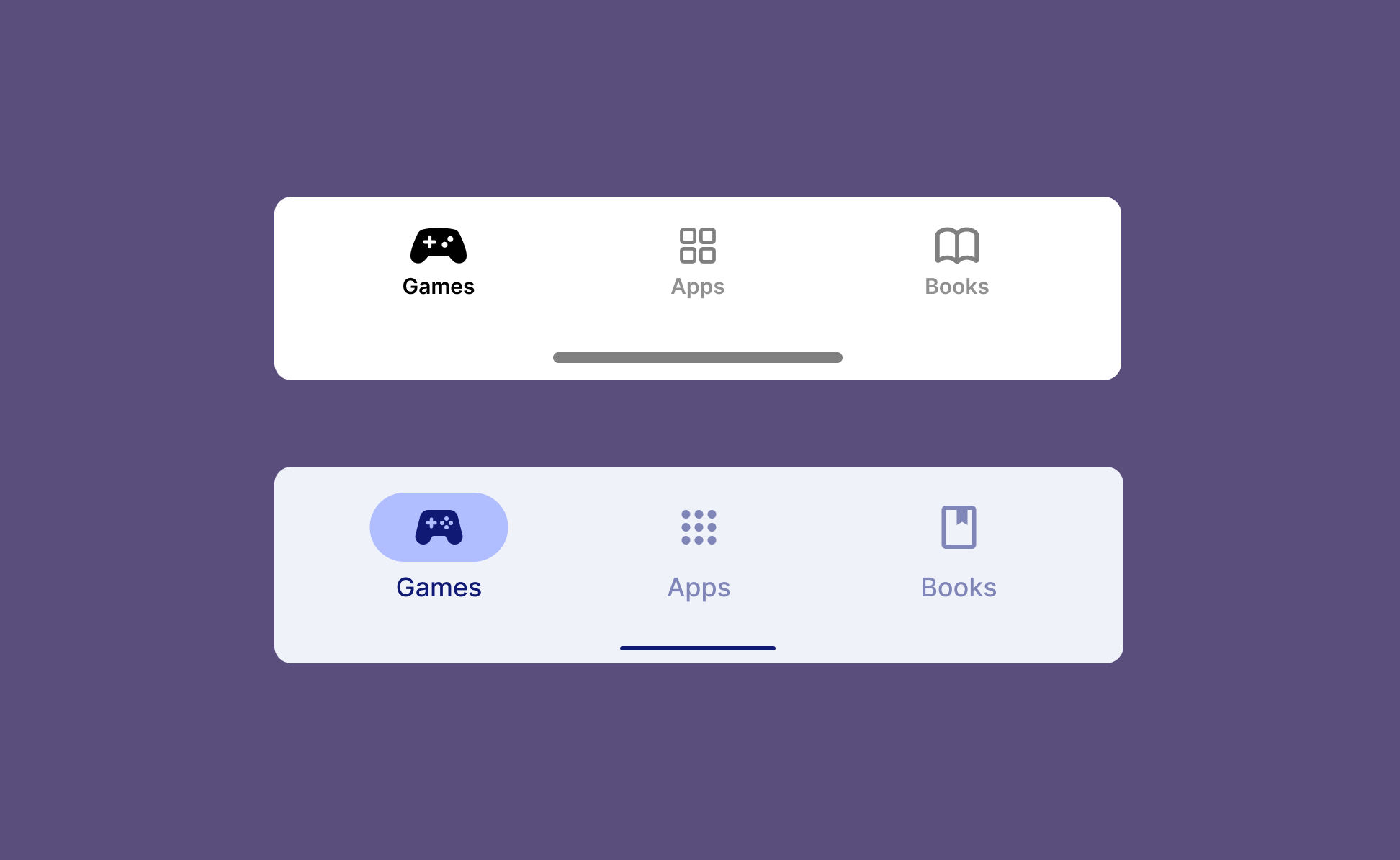
Tab bars on iOS usually have a basic styling with an icon and label for each tab. You can choose a different icon for the selected tab, such as a filled version or use color (or both) to emphasize the active tab.

On Android, navigation bars also consist of icons and labels, but additonally support an icon background on the selected tab, called an active indicator. If your app supports Material You’s dynamic colors, the navigation bar will naturally adapt to that color theme.
Summary
In conclusion, while there are some differences in styling between iOS and Android tab bars, the basic functionality remains the same.
As one of the main navigation patterns on both platforms, the challenge lies more in organizing the contents of your app in a meaningful way than in styling the tabs themselves. Stay tuned for a post on how to do just that.