7 Useful New Features in SwiftUI and UIKit
Apple held their annual WWDC conference in June, announcing iOS 17 along with updates to SwiftUI and UIKit. In this post, I’ll cover the most exciting new features and updates to these frameworks that designers can utilize when designing native iOS apps.
What’s new in SwiftUI?
1. Display tips with TipKit
A new framework called TipKit will make it easy to design onboarding flows and help your users discover new features by displaying tips in your app.
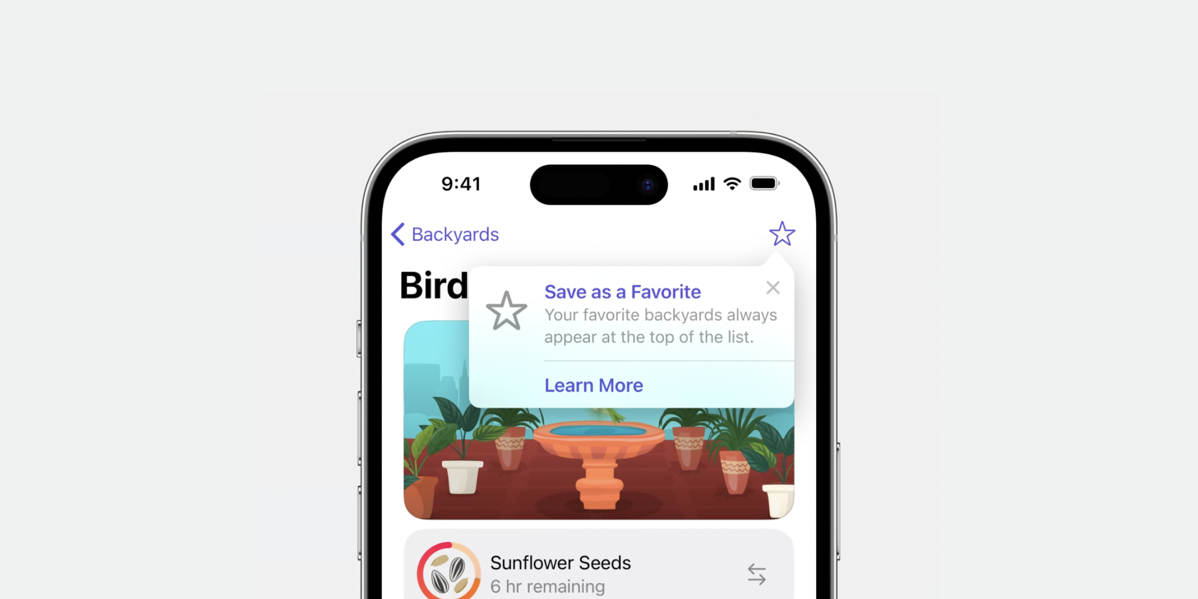
TipKit has two different types of tips; Popover and Inline View. Popovers appear above your apps’ UI, pointing at a part of your app, like a button that you want to highlight. Inline views are displayed inline and takes up space within the UI.
The framework also has options for advanced logic which means you can customize when tips will appear for different users. This can be great for onboarding flows where you might for example want to highlight more advanced features in your app only if a user has been using the app for a set number of days.
2. Create subscription screens with StoreKit
StoreKit is a framework that can help you set up payment or subscription screens in your app.
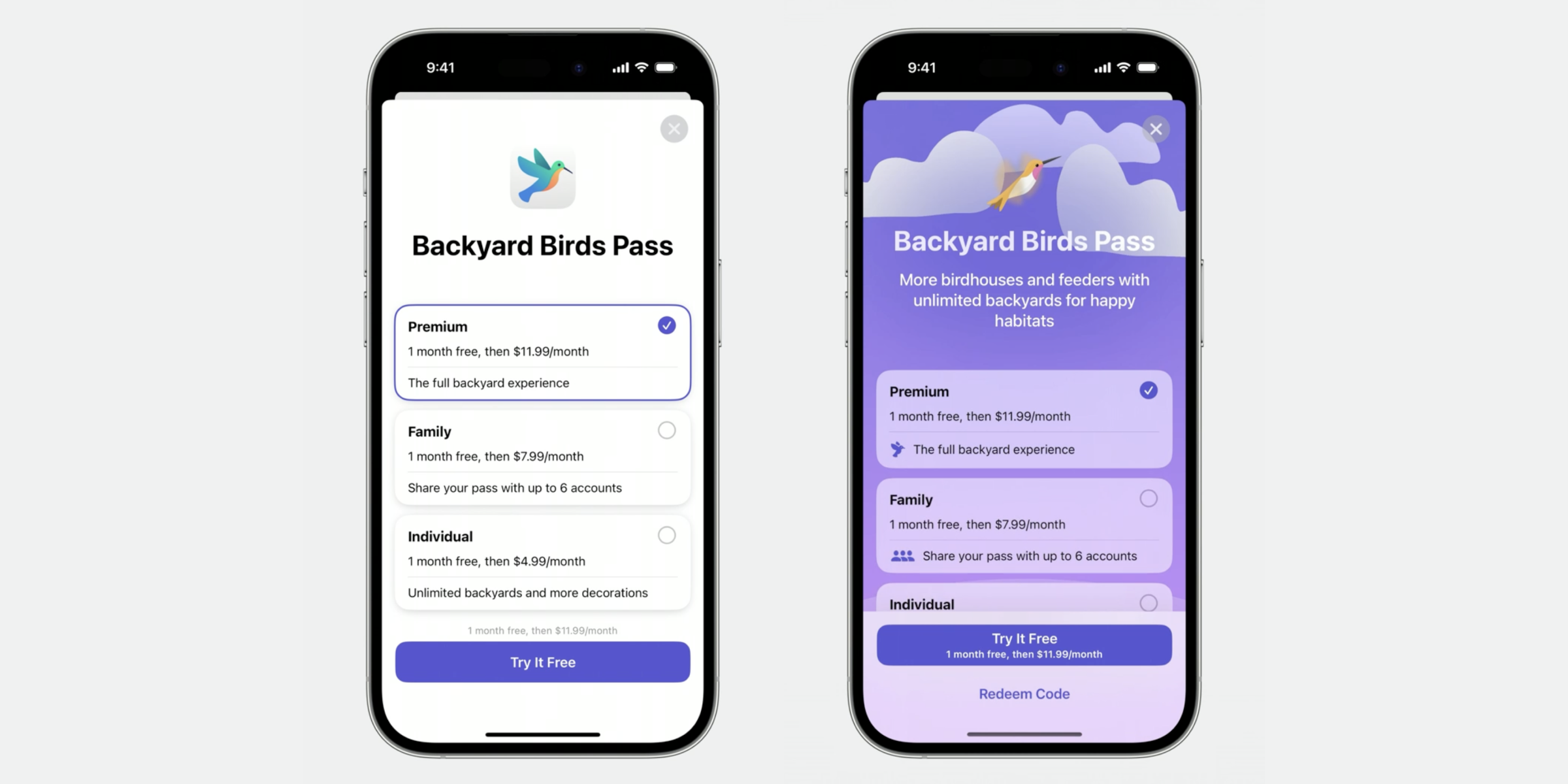
The new SubscriptionStoreView makes it easy to generate a complete subscription page based on your subscription alternatives. You can keep the screen as it is or tweak the design by adding your own illustrations and changing the background color.
The framework also includes support for multiple languages, allowing you to adjust your message based on localization.
3. Widgets become interactive
Interactive widgets are finally here!
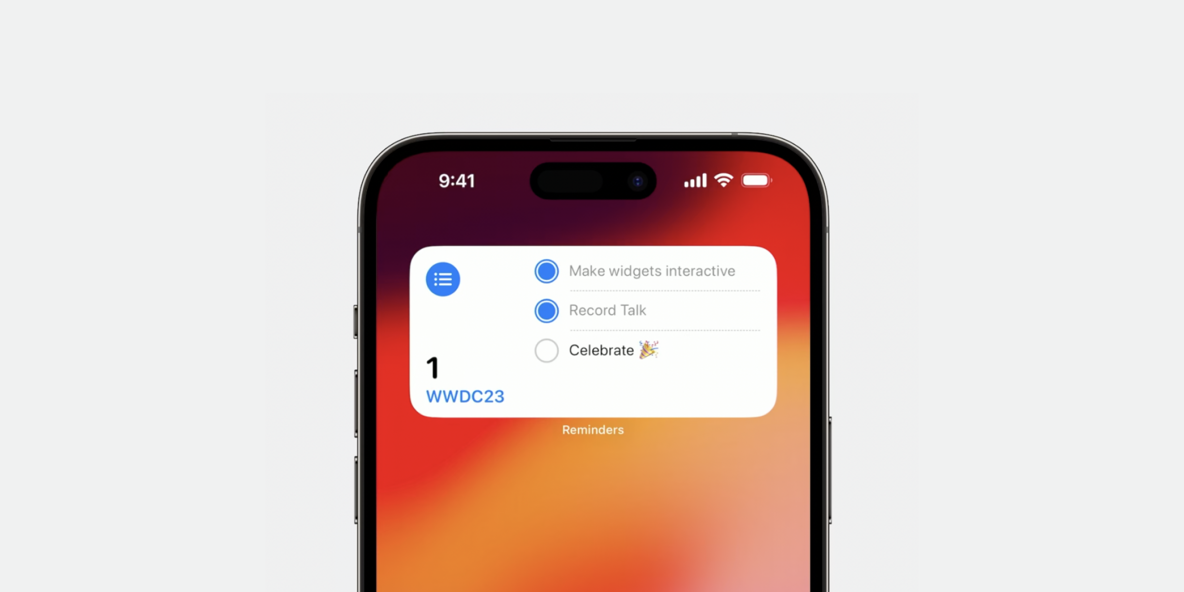
Before, widgets would only display information, and a tap on the widget would open the associated app. Now you can add actions to your widget, such as checking off a todo item, adding a glass of water to your water tracking, or starting and stopping a timer, all without opening the app.
You can also add animations to your widgets, creating smooth and natural transitions on interaction.
4. New StandBy mode
With iOS 17 comes a new way to view Live Activities called StandBy mode.
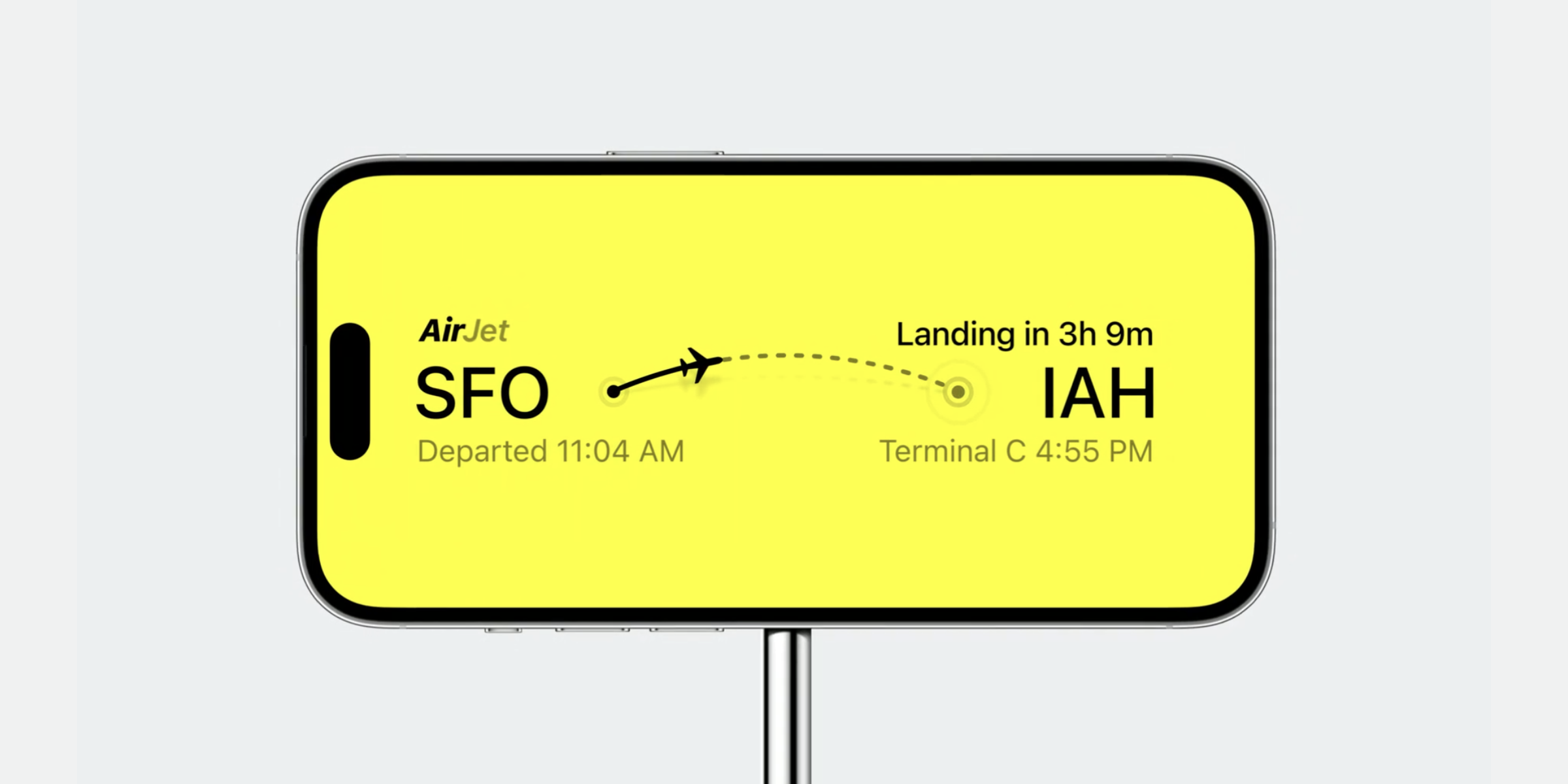
The mode is activated when your iPhone is placed on a charging stand and in landscape mode.
When StandBy mode is active, Live Activities will automatically scale up 200% to fill the screen.
To optimize your widget, make sure all the assets used are high enough resolution to be displayed at this size. Additionally, you can remove the background color of your widget (if you have a custom one) to make the widget blend seamlessly into the display bezels.
What’s new in UIKit?
5. Turn text into buttons with text interactions
One of the improvements to text interactions is the option to create link buttons within a body of text.
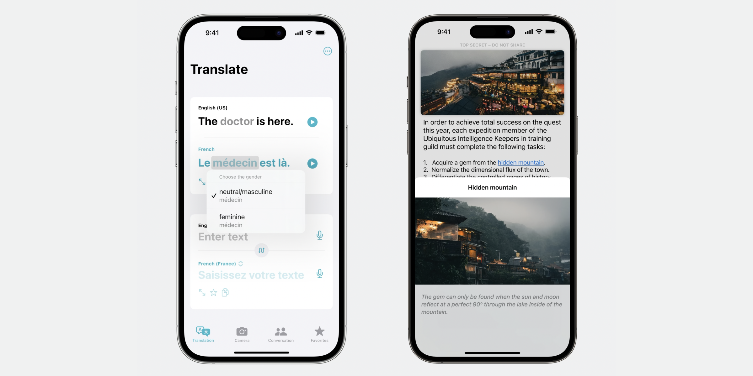
This can be used to link to other content in your app, such as for example opening a modal with more information about a place, a dictionary definition of a word, or as a “Show more” button to expand a longer text.
It can also be used to open a context menu for manipulating the content displayed in real time, such as in a translation app.
6. Instagram-like page controls
Improvements to page controls makes it possible to display timer progress in a slideshow.
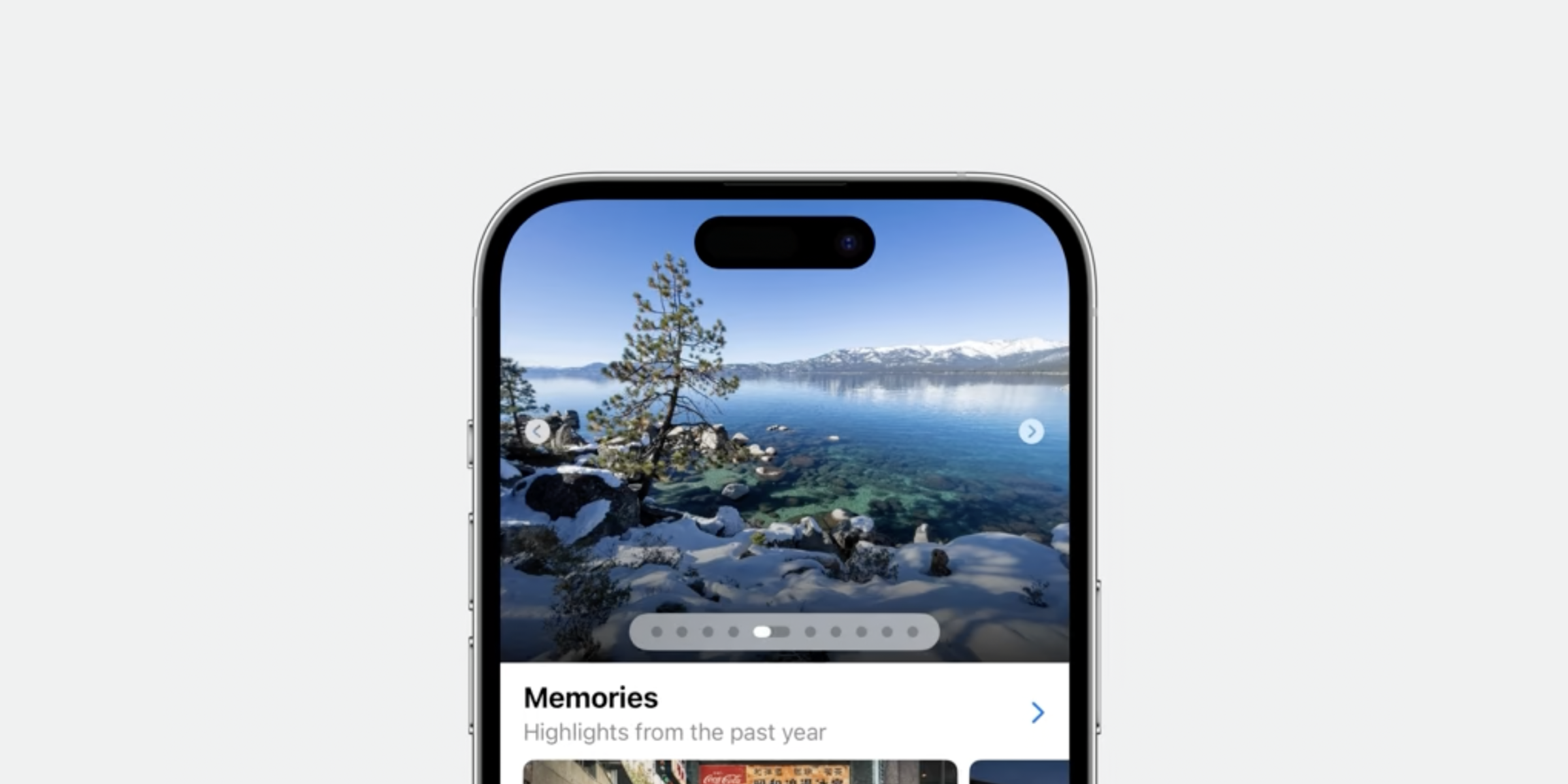
With the new page controls, you can visualize how long an image (or video) will be displayed before the slideshow moves to the next image—similar to what you might be used to with Instagram Stories.
7. New Palette menus
You might have seen palette menus when adding tags to files and folders in Finder on MacOS. Now these are available in UIKit to use for all platforms.
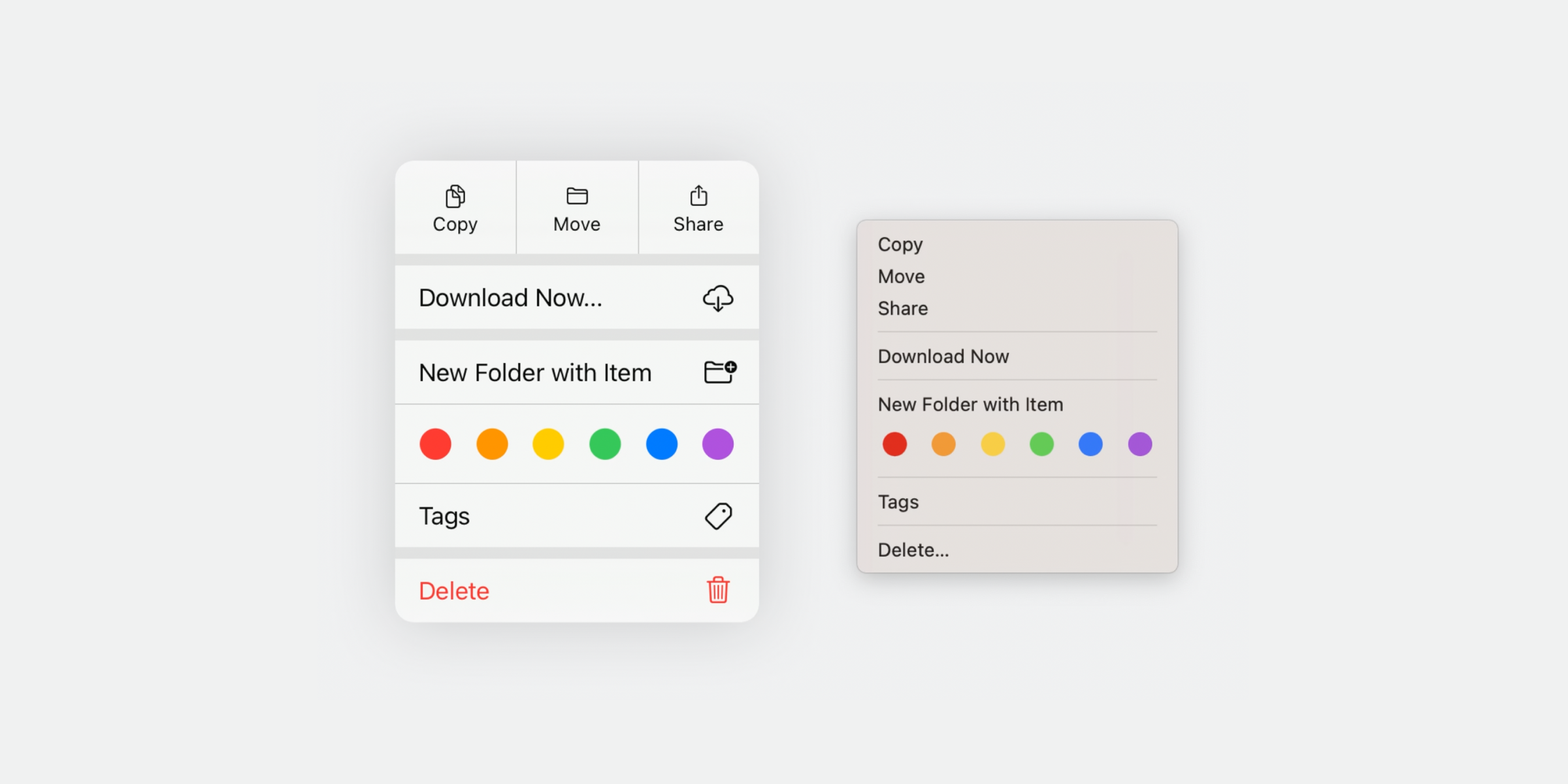
Palette menus lets you create a palette style selection controller in a context menu.
The most obvious use case for a palette menu would be for selecting different colors, but it could also be used for other things such as quickly tagging an element or switching between modes.
Conclusion
There are a lot of big and small updates coming to SwiftUI and UIKit this year, making it easier and faster than ever to design great native iOS experiences.
As usual, most of these updates will be supported from iOS 17, expected to launch this fall.
However, you can start designing today so you’re ready to use these new features once iOS 17 becomes available.
Which updates did you find most useful? Are there any updates you would like to hear about more in depth?
Let me know!

